Asian Paints Colour Shade Cards and Catalogues
Shade cards and magazines
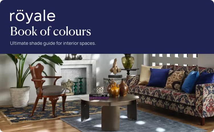
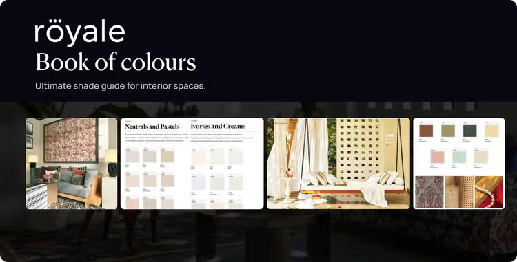
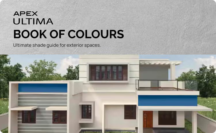
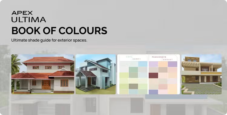
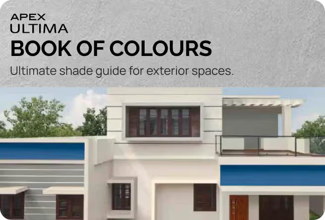











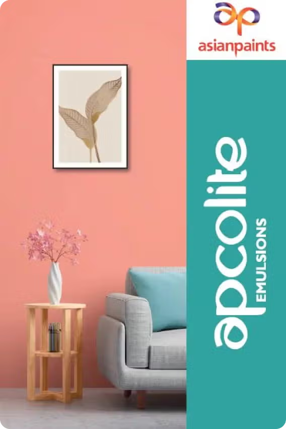

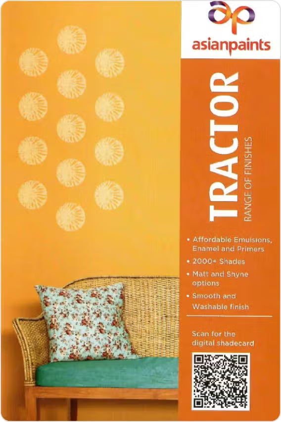












- Immediate
- Within a month
- After 1 month
- Yes
- No
What is a Colour Shade Card?
Choosing a wall colour can be difficult when you are looking at hundreds of shades. A colour shade card makes the process easier by bringing a range of colours together in one place, so you can compare them before deciding what works for your home.
A wall paint colour card typically displays different shades, often grouped by colour family. Depending on the collection, you may find everything from soft neutrals and pastels to deep blues, greens and vibrant accent colours.
You can use a shade card to narrow down your choices, compare similar shades and create a colour palette for different rooms.
Why Colour Shade Cards Are Important for Home Painting
A colour can look very different on a screen, in a showroom or on an actual wall. A shade card gives you a more practical way to explore colours before painting.
Instead of choosing a colour in isolation, you can place different swatches of colour next to each other and see which shades work well together.
A paint shade card is particularly useful when you are:
- Looking for a specific colour family
- Comparing light and dark variations of the same colour
- Creating a colour combination for adjoining rooms
- Matching walls with furniture or flooring
- Selecting colours for an accent wall
- Exploring colours for a complete home makeover
How to Use a Shade Card to Choose Wall Colours
A shade card is most useful when you use it as a starting point rather than making your final decision from the card alone.
Colour Families in Shade Cards
Colour shade cards are usually easier to navigate when shades are organised into broad families.
-
Pastel Shades
Pastels offer colour without the intensity of deeper shades.
Soft pinks, blues, greens, yellows and lavender can work particularly well in bedrooms, children's rooms and spaces where you want a gentle look.
-
Bold & Vibrant Colours
Deep reds, rich blues, vivid greens and other strong colours can become striking focal points.
If you are unsure about using a bold shade across an entire room, consider an accent wall or use the colour through smaller architectural details and décor.
Popular Wall Colour Shades for Indian Homes
The right wall colour depends on your home's architecture, lighting, furniture and personal style. However, some colour families remain versatile choices across many Indian interiors.
-
White & Off-White Shades
White and off-white shades create a clean, bright foundation.
Pure whites can feel crisp and contemporary, while warmer whites and off-whites can create a softer appearance. They can also make smaller spaces feel more open when paired with suitable lighting.
-
Beige & Cream Shades
Beige and cream offer warmth while remaining relatively easy to coordinate.
They work well with wooden furniture, earthy décor and a range of flooring materials. Warmer beige tones can create a comfortable, understated interior.
-
Grey Colour Shades
Grey can range from almost-white tones to deep charcoal.
Lighter greys can provide a modern neutral backdrop, while darker greys can add depth. Pay attention to undertones, as some greys can appear warmer or cooler depending on the lighting and surrounding colours.
-
Blue Colour Shades
Blue offers a wide range of possibilities, from pale blue and powder blue to navy and deeper teal tones.
Lighter blues can create an airy feel, while darker blues can provide a stronger focal point.
-
Green Colour Shades
Green brings a natural quality into interiors.
Soft sage and muted greens can create a calm appearance, while deeper greens can add richness. Green also pairs naturally with wood tones, beige and other earthy colours.
Asian Paints Colour Collections & Shade Catalogues
Exploring a large range of colours is easier when shades are organised into collections and catalogues.
Asian Paints colour collections and shade catalogues can help you browse different colour families, compare shades and find combinations for different rooms. When exploring a shade card, look beyond the individual colour. Consider how the shade might work with the rest of your home, including flooring, furniture, fabrics and lighting. If you are searching for a specific application, you may also come across specialised options such as an enamel paint shade card for enamel paint shades and finishes.
Incorporating Texture with Shade Cards
Colour is not the only way to add character to a wall. Texture can change how a colour is perceived by adding depth, pattern and variation to the surface. If you are considering a textured wall, first shortlist the colour you like and then think about how the texture will interact with it. A darker shade with a strong texture can create a dramatic focal wall, while a subtle texture in a neutral shade can add interest without dominating the room. Always consider the size and lighting of the wall before selecting a heavily textured finish.
How Lighting Affects Paint Colours
Lighting can change the appearance of almost any paint colour.
Natural daylight can reveal the undertones of a shade, while warm artificial lighting may make some colours appear more yellow or warmer. Cool lighting can make certain shades appear sharper or bluer.
The direction and amount of sunlight also matter. A colour that looks soft in one room may appear significantly brighter in another. This is why colour swatches should ideally be viewed in the actual room and at different times of the day before you make your final selection.
Trending Wall Colour Combinations for Modern Homes
Modern interiors often combine a neutral base with one or two complementary shades rather than using several competing colours.
Some combinations to explore include:
- Off-white with muted green
- Beige with terracotta
- Soft grey with deep blue
- Cream with olive green
- Warm white with earthy brown
- Pale blue with white
- Greige with muted blush
The best combination depends on your existing interiors. Before finalising a palette, look at your flooring, furniture, curtains and other permanent elements.
Benefits of Exploring Colour Catalogues Before Painting
A colour catalogue or shade book can help you move from vague ideas to a more defined palette.
-
Better Colour Visualization
Seeing related shades together gives you a better understanding of how light, dark, warm and cool variations compare.
-
Easier Shade Comparison
When several shades look similar, comparing them together makes subtle differences easier to identify.
-
Improved Colour Coordination
A catalogue can help you select a main shade and supporting colours rather than choosing each wall colour independently.
-
More Confident Colour Selection
Shortlisting colours before painting gives you time to consider your options, test samples and make a decision without rushing.
FAQs on Colour Shade Card
Always test shortlisted shades on the actual wall before painting the entire space.
A colour catalogue may contain a broader collection of shades along with colour combinations, room inspiration, finishes or other information.
The exact format can vary by brand and collection.
Observe them in both daylight and artificial light before making your final decision.
However, colour is only one factor. Lighting, furniture placement, ceiling height and visual clutter also influence how spacious a room feels.
Strong sunlight can make some colours appear brighter, while shaded rooms may make the same shade appear deeper. Check your shortlisted colours at different times of day before finalising them.
The most suitable shade depends on your home's lighting, décor, architecture and personal preferences.
For example, a neutral base can be paired with an earthy accent, or a soft cool shade can be balanced with warm wood tones. Use the colour wheel and your shade card to explore combinations before painting.
A shade card is a useful starting point, but the final choice should always be made with your actual space in mind. Explore the colours, shortlist your favourites, test them under your home's lighting and then choose the shades that feel right for your walls.