

TRENDING
Colour Palette
interior Painting Services
The 60-30-10 Rule: How to Create a Balanced Colour Palette for Your Home
A well-balanced colour palette can completely transform the look and feel of your home. The right mix of colours creates harmony, adds personality, and makes every room feel thoughtfully designed.
That is where the 60-30-10 rule comes in. Interior designers often use this simple technique to create visually balanced spaces that feel stylish and comfortable at the same time.
If you want your home interiors to look polished without feeling overwhelming, this colour palette rule can make the process much easier.

What is the 60-30-10 Rule in Interior Design?
The 60-30-10 rule is a simple design formula that helps create balance in a room using three colours.
Here is how it works:
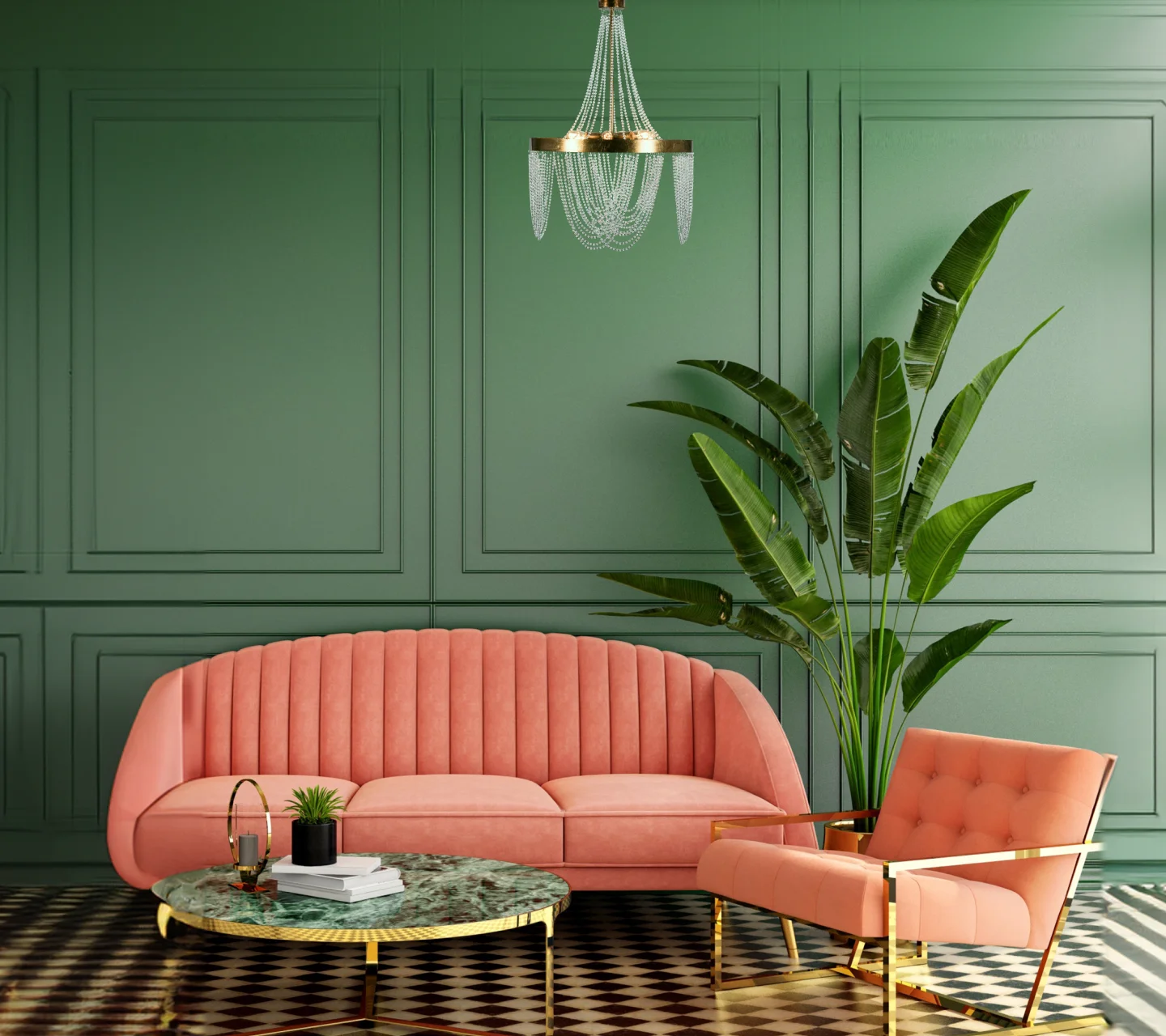
60% of the room uses the dominant colour
30% uses the secondary colour
10% uses the accent colour
This method creates visual harmony while adding enough contrast and personality to make the space feel interesting and stylish.
Interior designers often use this rule in living rooms, bedrooms, dining spaces, and even kitchens.
The Basics of the 60-30-10 Rule
Before applying the rule, it helps to understand the role of each colour in the palette.

Dominant Colour
The dominant colour covers most of the room and sets the overall mood of the space. This colour usually appears on walls, large furniture pieces, rugs, or curtains.
Neutral shades like beige, white, grey, and cream work beautifully as dominant colours. You can also choose richer tones like blue, green, or terracotta if you want a bolder look.

Secondary Colour
The secondary colour supports the dominant shade and adds depth to the design. It should create contrast while still blending smoothly with the main colour palette.
You can introduce this colour through furniture, accent walls, upholstery, or large décor elements.
For example:
Beige pairs beautifully with brown, olive green, or navy blue
Grey works well with blush pink, mustard yellow, or teal
White complements almost every colour palette

Accent Colour
The accent colour adds energy and personality to the room. This shade appears in smaller details like cushions, artwork, vases, lamps, throws, or decorative accessories.
Bright shades like yellow, emerald green, burnt orange, coral, or gold work especially well as accent colours.
Since the accent colour covers only 10% of the room, it creates visual interest without overpowering the space.
Choosing Your Colour Palette
The first step is selecting a dominant colour that matches the mood you want for the room.
If you prefer calm and peaceful interiors, choose soft neutrals, pastel shades, or earthy tones. For vibrant and energetic spaces, explore bold colours like navy blue, rust orange, emerald green, or deep plum.
Once you finalise the dominant shade, select a secondary colour that complements it beautifully.

A simple way to choose colour combinations is by using the colour wheel:
Opposite colours create bold contrast
Similar colours create a soft and harmonious look
After that, choose an accent shade that adds freshness and personality to the room.
For example:
Grey + Blue + Mustard Yellow
Beige + Brown + Olive Green
White + Sage Green + Terracotta
Navy Blue + Cream + Gold
Applying the 60-30-10 Rule
You can apply the 60-30-10 rule in several ways across your home interiors.

Through Furniture and Décor
This remains one of the easiest ways to use the rule.
For example:
Beige walls and sofas as the dominant colour
Blue accent chairs and curtains as the secondary colour
Yellow cushions and artwork as the accent shade
This creates a balanced and visually appealing space.

Through Flooring and Textiles
Flooring, carpets, bedding, and curtains can also help distribute colours beautifully.
For example:
Grey flooring and walls for the dominant colour
White bedding and curtains for the secondary shade
Coral cushions and décor accessories for the accent wall colour
This approach creates depth while keeping the room cohesive.

Through Wall Treatments
You can also apply the rule directly on the walls.
For example:
Main walls painted in a neutral shade
One feature wall in a deeper contrasting colour
Accent décor pieces that introduce the final pop of colour
Wallpaper, wall panelling, and textured finishes can further enhance the design.
Design a Stylish Indian Home with the 60-30-10 Rule
Indian homes often feature a mix of textures, colours, and traditional elements. The 60-30-10 rule helps bring balance to these layered interiors while keeping the overall look elegant and organised.

For example:
Warm beige walls with walnut wood furniture and emerald green accents
White interiors with terracotta décor and mustard highlights
Grey modern interiors with navy blue furniture and brass accents
This design method works beautifully across both compact apartments and spacious homes.

Create a Balanced Home with Thoughtful Décor Choices
The right décor pieces help tie the entire colour palette together. Furniture, rugs, curtains, lighting, artwork, and accessories all play a role in maintaining balance within the space.
Choose textures, finishes, and colours that support your chosen palette while reflecting your personality and lifestyle.
Small details often create the biggest impact.

Add Personality with Paints and Wallpapers
Paint shades and wallpapers can completely change the mood of a room. If you want a more unique look, combine paint colours with textured wallpaper, printed wall coverings, or statement finishes.
Floral prints, geometric patterns, metallic accents, and textured surfaces can add depth and character while still following the 60-30-10 rule.
You can also experiment with trend-forward shades like sage green, warm beige, muted terracotta, dusty pink, or soft blue-grey for a fresh and modern look.
Final Thoughts
The 60-30-10 rule offers a simple and effective way to create balanced and stylish interiors. It helps organise colours thoughtfully while allowing enough room for creativity and personal style.
Whether you prefer minimal interiors, luxurious spaces, or vibrant Indian homes, this timeless design formula can help you build a home that feels cohesive, elegant, and welcoming.
LIKE THIS ARTICLE
Give us a thumbs up!
TEXTURE FINISH
Royale Play special effects for the interior


Call us for Painting Services
 1800-209-5678
Are you looking for home interiors?
Get tailored made designs from our interior design services by asian paints.
Are you looking for home interiors?
Get tailored made designs from our interior design services by asian paints.
Fill the form below to book an appointment with an in house interior designer.