

TRENDING
Wall colour combination
Best Colour Combinations for an Ombre Wall in Indian Homes
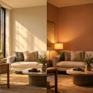
Somewhere between a plain painted wall and a full-blown mural, there's the ombre wall, the design equivalent of a really good sunset. One shade gently melts into the next, and suddenly your room looks like it was styled by someone who owns a colour wheel and actually knows how to use it. If you've been eyeing a wall colour combination for bedroom spaces that feels a little more artistic than usual, here's your complete guide to pulling off an ombre look at home.
TABLE OF CONTENTS
Why Ombre Walls Are Becoming Popular in Indian Homes
How to Choose Colours for an Ombre Wall
Popular Ombre Colour Combinations for Indian Homes
Best Ombre Colours for Different Rooms
Vertical vs Horizontal Ombre Designs
Choosing Paint Finishes for Ombre Walls
What Is an Ombre Wall?

Understanding the Ombre Effect
It's a gradual colour transition, dark to light or vice versa, that flows smoothly across a wall instead of stopping in a hard line.
How Ombre Differs From Two-Tone Walls
A two colour combination for bedroom walls usually has a clean, visible split; ombre blurs that same line into a soft, blended gradient instead.
Why Ombre Walls Are Becoming Popular in Indian Homes

Creates Visual Depth and Dimension
A single wall suddenly has movement and depth, making the whole room feel more layered and considered..
Works Across Modern and Traditional Interiors
From minimalist apartments to more traditional homes, an ombre-style bedroom wall colour combination adapts to the style around it rather than fighting it.
How to Choose Colours for an Ombre Wall
Staying Within the Same Colour Family
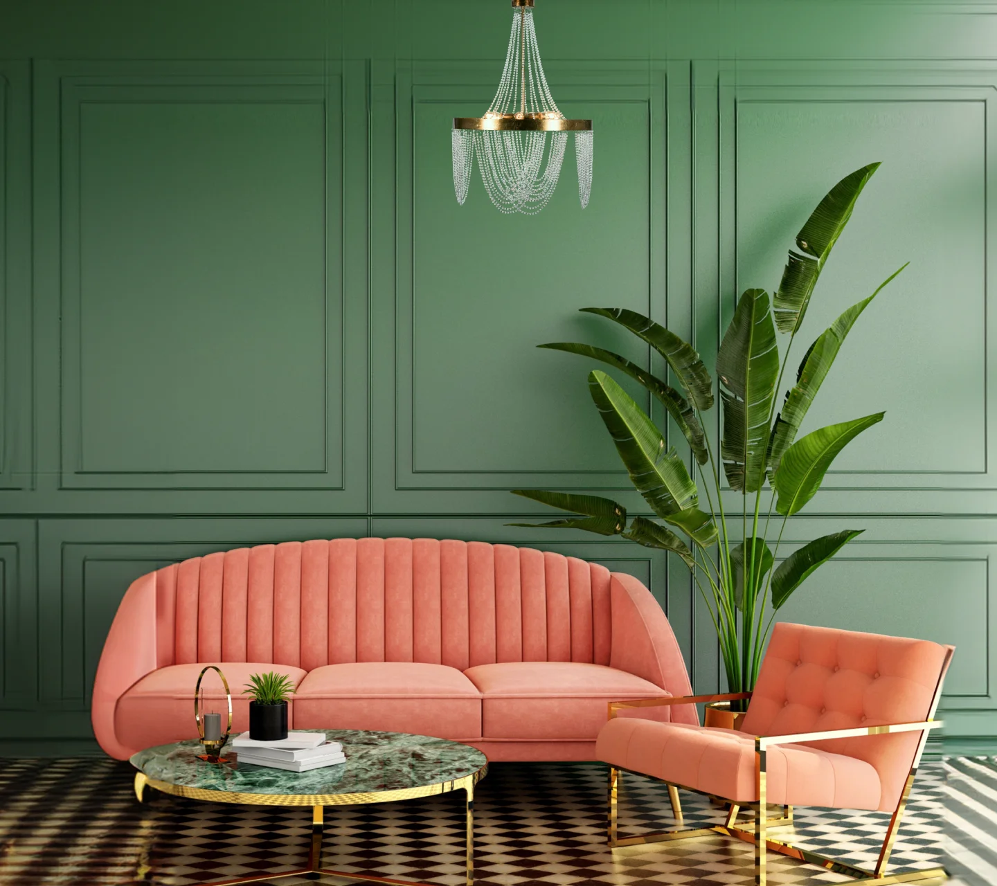
The safest, most flattering route: pick shades from one colour family so the wall colour combination feels effortless, not jarring.

Choosing Contrasting Shades Carefully
Bolder combinations, including a bold purple colour palette, can work beautifully too; just test them side by side before committing an entire wall to the idea.
Considering Natural and Artificial Lighting
Light changes how gradients read, so check your chosen bedroom wall colour combination in both daylight and lamplight before painting.
Popular Ombre Colour Combinations for Indian Homes
Blue Ombre Walls
Deep navy fading into a soft sky blue reads calm and coastal, perfect for bedrooms and reading nooks.
Green Ombre Walls
Forest green melting into a fresh sage brings the outdoors in without a single houseplant required.
Grey Ombre Walls
Charcoal to dove grey is quietly sophisticated, a safe bet for living rooms that want to feel grown-up.
Pink Ombre Walls
A rich pink two-colour combination for bedroom walls, fading from berry to blush, is romantic without tipping into overly sweet.

Beige and Neutral Ombre Walls
Warm taupe into soft cream is the quiet achiever of ombre walls, elegant and endlessly easy to live with.
Sunset-Inspired Ombre Combinations
Orange melting into pink, or a bolder purple colour palette, brings genuine golden-hour drama into a room, any time of day.
Best Ombre Colours for Different Rooms
Living Room Ombre Ideas
Cooler blues and greys work well here, adding personality without overwhelming a shared space.
Bedroom Ombre Ideas
Soft purples, blush pinks, and muted blues create a calming wall colour combination for bedroom spaces built for winding down. A gentle pink two-colour combination for bedroom walls is an easy, romantic starting point if you're new to ombre.
Common Paint Defects That Should Be Documented
Roller Marks and Brush Marks
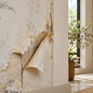
Visible streaks usually point to rushed application, something reputable painting contractors rarely let slip through.
Paint Runs, Drips and Sagging
Drips happen when paint's applied too thick, a rookie mistake that shouldn't survive a job done by professional painters.

Kids' Room Ombre Ideas
Playful pastels or a rainbow-adjacent gradient add whimsy without needing an entire mural.
Study Room Ombre Ideas
Cooler, muted tones support focus, while still giving the room a little visual interest.
Light vs Dark Ombre Walls

Soft and Subtle Transitions
Close, related shades create a gentle gradient that reads as sophisticated rather than dramatic.
Bold and Dramatic Transitions
A wider gap between shades, like deep charcoal into pale grey, makes a much bigger visual statement, especially as a standout bedroom wall colour combination.
Vertical vs Horizontal Ombre Designs

When to Use Vertical Ombre Effects
Vertical gradients draw the eye upward, making ceilings feel a touch higher, handy in compact rooms.
When to Use Horizontal Ombre Effects
Horizontal transitions feel grounded and calm, ideal for wider walls or rooms with a low, cosy vibe.
Choosing Paint Finishes for Ombre Walls

Matte Finishes
Matte keeps the gradient looking soft and painterly, without any distracting shine.
Satin Finishes
A touch of sheen adds subtle depth to the transition, especially under good lighting.
Premium Decorative Finishes
Metallic or textured decorative finishes can push a wall colour combination for bedroom spaces from nice to genuinely showstopping.
How Lighting Affects Ombre Wall Colours

Warm bulbs tend to intensify the deeper end of a gradient, while daylight-toned lighting keeps the whole transition looking closer to true colour, worth testing before you commit to any bedroom wall colour combination.
Ombre Walls vs Accent Walls
A traditional accent wall is one bold, solid colour; an ombre wall does the same attention-grabbing job but with considerably more nuance, and a lot more photo potential.
Frequently Asked Questions
Which colours work best for an ombre wall?
Shades from the same colour family, like navy into sky blue or forest into sage, blend the most smoothly into a cohesive wall colour combination for bedroom or living spaces alike.
Are ombre walls suitable for small rooms?
Yes, especially with vertical gradients, which can visually add height to a compact space.
Can an ombre wall be created using three or more shades?
Definitely, multi-shade gradients can look stunning, including a layered purple combination colour palette, though they take a bit more planning to blend seamlessly.
Which rooms are best suited for ombre wall designs?
Bedrooms and living rooms are popular choices, though any wall with enough uninterrupted space works well for a striking bedroom wall colour combination.
Does lighting affect how an ombre wall looks?
Significantly, warm and cool lighting can shift how the gradient reads, so it's worth testing your palette under your room's actual lighting.
Should ombre walls be matte or satin finished?
Both work well; matte gives a softer, painterly look while satin adds a subtle extra dimension to any two-colour combination for bedroom walls you're considering.
An ombre wall is proof that paint doesn't have to pick just one colour to make a statement; it can pick two, blend them beautifully, and let your wall do the talking. Pick a wall colour combination for living spaces or bedrooms that you genuinely love, take your time with the blending, and enjoy a feature wall that never really goes out of style.
LIKE THIS ARTICLE
Give us a thumbs up!
TEXTURE FINISH
Royale Play special effects for the interior


Call us for Painting Services
 1800-209-5678
Are you looking for home interiors?
Get tailored made designs from our interior design services by asian paints.
Are you looking for home interiors?
Get tailored made designs from our interior design services by asian paints.
Fill the form below to book an appointment with an in house interior designer.