

Painting services
Colour combination
Colour Combinations for Open-Plan Living, Dining and Kitchen Spaces
An open-plan home can look spacious and effortless when the colours are right. But when the living room, dining area and kitchen all sit within the same view, choosing colours becomes a little more complicated.
You cannot really pick a living room colour without thinking about the kitchen cabinets next to it. The dining area also becomes part of the picture, along with the flooring, sofa, curtains and even the light coming through the windows.
The good news is that everything does not have to match. What matters is that the colours feel like they belong together.
IN THIS ARTICLE
Why Colour Planning Matters in Open-Plan Spaces
How to Choose a Colour Scheme for Open-Plan Spaces
Popular Colour Combination Ideas for Open-Plan Homes
How to Create Visual Continuity Between Living, Dining and Kitchen Areas
Colour Combinations for Different Interior Styles
Using Accent Colours Without Disrupting Flow
Common Colour Mistakes to Avoid in Open-Plan Spaces
How Lighting Affects Colour Combinations in Open-Plan Homes
Best Colour Combination Strategies for Small Open-Plan Spaces
Why Colour Planning Matters in Open-Plan Spaces

What Makes Open-Plan Layouts Different?
In a conventional home, a wall gives you a natural stopping point. You can have blue in one room, beige in another and green somewhere else without the colours competing too much.
An open-plan layout does not give you that luxury. From the sofa, you might be able to see the dining table and half the kitchen. From the kitchen, you may be looking straight at the living room wall.
That makes the overall palette more important than the colour of any single room.
The Challenge of Creating Visual Flow
The easiest way to create flow is not to use one colour everywhere. Instead, choose colours that have something in common.
For example, a warm white living room can sit comfortably beside a kitchen with beige or light wood cabinets. Add muted green through dining chairs or cushions, and the spaces feel connected without looking identical.
Balancing Unity and Individuality Across Zones
Each area should still have some identity.
The living room can be the softer, more relaxed part of the home. The dining area can carry a little more warmth, while the kitchen can stay fresh and practical.
The colours simply need to relate to one another.
How to Choose a Colour Scheme for Open-Plan Spaces

Start with a Primary Anchor Colour
Start with the largest surface you are going to paint. Usually, that means the main walls.
If you are unsure, begin with a shade that is easy to live with. Warm white, ivory, beige, greige and soft grey are good starting points because they work with a wide range of furniture and finishes.
Asian Paints has a large interior colour catalogue, so it is worth looking at actual shades rather than choosing a generic “beige” or “grey” from a screen.
Select Complementary and Accent Colours
Once you have the main colour, choose one or two supporting shades.
A useful rule is to let one colour do most of the work. The others can appear in smaller areas such as a dining wall, cushions, artwork, kitchen accessories or an accent chair.
This keeps the space interesting without making every wall compete for attention.
Consider Natural and Artificial Lighting
The same paint can look surprisingly different from morning to evening.
A room with strong sunlight can handle deeper colours more easily. A darker kitchen corner may need a lighter wall to keep it from feeling closed in.
Before finalising a colour, test it in the actual room and look at it at different times of day. Asian Paints also recommends testing samples in the space before making a final decision.
Match Colours with Flooring and Furniture
Look around before you choose the paint.
If you already have walnut furniture, cream sofas and beige flooring, introducing a very cool grey may make the room feel disconnected. Similarly, a strong coloured sofa does not necessarily need another strong colour on the walls.
Sometimes the best wall colour is the one that quietly allows the furniture to stand out.
Popular Colour Combination Ideas for Open-Plan Homes

White and Warm Wood Tones
This combination is hard to get wrong. White keeps the space open, while wood adds the warmth that an all-white interior can sometimes lack.
It works especially well when the kitchen has wooden or wood-finish cabinets.
Greige and Sage Green
Greige is useful when plain grey feels too cold and beige feels too warm. Pair it with sage green for a relaxed, contemporary look.
The green can appear on one wall or through furniture and décor rather than taking over the entire space.
Beige and Terracotta
If you want a warmer home, beige and muted terracotta are worth considering. Terracotta works particularly well in the dining area because it brings some depth without requiring a very dark wall.
Grey and Blue
Grey and blue make a good choice for a modern home. Keep the blue muted if the kitchen and living room are small, and use white or light grey to keep the overall space balanced.
Cream and Olive Green
Cream and olive work beautifully with wooden furniture and natural materials. Olive is also easier to use in an open plan than a very bright green because it feels more grounded.
Taupe and Dusty Pink
Dusty pink does not have to make a home look overly feminine. Paired with taupe, it can feel warm and sophisticated. Keep the pink muted and use it selectively.
How to Create Visual Continuity Between Living, Dining and Kitchen Areas

Using Different Shades of the Same Colour Family
You can use three related shades instead of one colour throughout.
For example, use a pale cream on the main walls, a slightly deeper beige around the dining area and a similar neutral near the kitchen.
The change is subtle, but it helps separate the zones.
Repeating Accent Colours Across Spaces
If you use sage green in the kitchen, repeat a little of it in the living room. If there is terracotta in the dining area, bring it back through a cushion, rug or artwork.
This small detail can make a big difference.
Coordinating Wall Colours with Cabinet Finishes
An open kitchen needs to be considered alongside the living room. A kitchen colour combination that looks great on its own may feel out of place when viewed from the sofa.
For open kitchens, Asian Paints suggests neutral palettes and colours that blend with the adjoining living area. White, beige, grey, wood and softer colours are particularly easy to work with.
Using Textures and Materials to Support the Colour Scheme
You do not need more colours to make an open-plan space interesting.
Wood, cane, stone, marble, metal, linen and textured fabrics can all add variation. In fact, using different textures within a restrained palette often looks more sophisticated than adding another paint colour.
How to Choose Wall Colours to Match Furniture and Decor
Choose the wall colour after considering the big pieces.
Your sofa, dining table, curtains, flooring and kitchen cabinets will occupy much more visual space than a few decorative objects. If these elements are already patterned or colourful, let the walls be quieter.
Colour Combinations for Different Interior Styles

Modern and Minimalist Open-Plan Interiors
Try warm white, soft grey, greige or beige with black or natural wood accents. Keep the number of colours limited and let clean lines do the work.
Contemporary Indian Homes
Warm neutrals, olive, terracotta, muted yellow and earthy greens work well with Indian furniture, wooden finishes and textiles.
Contemporary Indian Homes
Warm neutrals, olive, terracotta, muted yellow and earthy greens work well with Indian furniture, wooden finishes and textiles.
Scandinavian-Inspired Spaces
Think white, cream, pale grey and light wood. A small amount of sage, blue or another muted pastel can add colour without losing the airy feel.
Luxury and Premium Interiors
For a more dramatic home, consider charcoal, deep blue, olive or rich taupe against lighter surrounding walls. Metallic details, stone surfaces and good lighting can add the premium touch without needing very bright colours.
Using Accent Colours Without Disrupting Flow

Accent Walls in Open-Plan Layouts
An accent wall can help establish the living or dining area, but it should have a reason for being there.
A wall behind the television, sofa or dining table is usually easier to work with than an arbitrary wall simply chosen because it is available.
Soft Furnishings and Decorative Elements
An accent colour does not always need to be painted.
Curtains, cushions, rugs, artwork and dining chairs are useful when you want to experiment with a stronger shade without making a permanent change.
Kitchen Islands and Dining Areas as Accent Features
If your kitchen has an island, it can become the bridge between the kitchen and living area.
A contrasting cabinet colour, wooden finish or pendant light can give the kitchen some personality while the walls remain neutral.
Common Colour Mistakes to Avoid in Open-Plan Spaces

Using Too Many Contrasting Colours
Five different colours may sound exciting on a mood board. In a real home where you can see everything at once, they can quickly become too much.
Pick a base and build around it.
Ignoring Sightlines Between Rooms
Stand in the kitchen and look towards the living room. Then sit on the sofa and look back.
This simple exercise often reveals which walls are going to dominate the space.
Overlooking Lighting Conditions
Do not choose a colour only under the shop's lighting or on your phone. Natural light, warm bulbs and cool LEDs can all change how a shade appears.
Choosing Colours Without Considering Furniture
A paint colour can look completely different once a dark sofa, wooden cabinet or patterned rug is placed in front of it.
Choose the paint with the room, not separately from it.
How Lighting Affects Colour Combinations in Open-Plan Homes

Lighting is one of the reasons a colour combination that looks perfect in one home may not work in another.
Large windows can make pale colours appear brighter. Warm artificial lights can bring out yellow and beige undertones. Areas with less natural light may make grey or blue feel stronger.
For this reason, samples are worth the effort. Put them near the sofa, beside the kitchen cabinets and close to the dining area if possible. Asian Paints' colour inspiration resources also encourage homeowners to assess colours in relation to the surrounding furniture and changing light.
Best Colour Combination Strategies for Small Open-Plan Spaces

Small open-plan homes usually benefit from keeping the main walls relatively light.
White, cream, pale beige and soft grey can help the different areas feel like one larger space. You can then introduce stronger colours through the kitchen cabinets, dining chairs, artwork or one carefully chosen accent wall.
Another useful trick is to avoid too many visual breaks. Similar wall colours, continuous flooring and repeated materials can make a compact home feel more spacious.
For a small open kitchen, combinations such as white and wood, grey and wood, or light neutrals with a muted accent are practical starting points. Asian Paints also features these kinds of combinations in its kitchen inspiration.
Frequently Asked Questions
What is the best colour combination for an open-plan living, dining and kitchen area?
Warm white with wood, greige with sage green, beige with terracotta and cream with olive are all good starting points. The best choice depends on your flooring, furniture, cabinetry and natural light.
Should all rooms in an open-plan space use the same colour?
No. They should feel connected, but they do not have to be identical. Related shades or repeated accent colours can create continuity while still giving each zone some character.
How can I define different zones without using different wall colours?
Use rugs, furniture placement, lighting, artwork, curtains and kitchen cabinetry. A dining table and pendant light can visually separate the dining area without requiring another wall colour.
Which colours make open-plan spaces look larger?
Lighter colours such as white, cream, ivory, pale beige and soft grey generally help smaller spaces feel more open. Keeping the palette fairly continuous also reduces visual clutter.
How do I choose colours for an open kitchen and living room?
Look at both spaces together. Start with the kitchen cabinets and flooring, then choose a wall colour that works with them as well as the sofa and other living room furniture.
Can accent walls work in open-plan layouts?
Yes. They work best when the accent wall naturally belongs to one zone and the colour relates to the rest of the palette.
How to Choose a Smart Colour Palette Based on Lighting and Furniture
Start with what is already fixed in the room: flooring, kitchen cabinets, countertops and large furniture. Pick a main wall colour that works with those elements, then add one supporting colour and a smaller accent.
Most importantly, test the colours before painting the entire space. A shade that looks perfect online can behave very differently once it is next to your flooring, sofa and kitchen cabinets.
LIKE THIS ARTICLE
Give us a thumbs up!
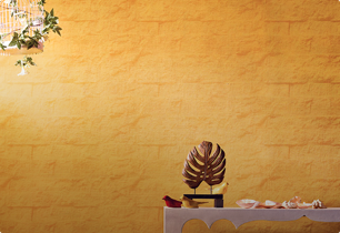
TEXTURE FINISH
Royale Play special effects for the interior


Call us for Painting Services
 1800-209-5678
Are you looking for home interiors?
Get tailored made designs from our interior design services by asian paints.
Are you looking for home interiors?
Get tailored made designs from our interior design services by asian paints.
Fill the form below to book an appointment with an in house interior designer.