

Kitchen Makeover
Kitchen Colour Combinations
Trending parallel kitchen colour combinations
The kitchen is one of the most used spaces in any home. It is where daily routines begin and where conversations often happen at the end of the day. With so much activity, the design of your kitchen should feel both functional and inviting.
A parallel kitchen is a popular choice, especially in modern homes. With two counters facing each other, it offers efficiency, easy movement, and smart storage. The right kitchen colour combination can enhance this layout and make the space feel more open, organised, and visually appealing.
Here are some well-balanced and practical colour ideas to help you design a parallel kitchen that looks refined and works beautifully.
Understanding parallel kitchen design
A parallel kitchen, also known as a galley kitchen, has two workspaces running side by side. This layout is ideal for compact homes as it uses space efficiently and keeps everything within easy reach.
Since cabinets, countertops, backsplash, and flooring sit close to each other, colours play a big role in how the kitchen feels. A thoughtful palette can make a small kitchen look larger and a busy space feel more cohesive.


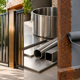
1. Chrome yellow and steel grey
If you want a kitchen that feels lively, this combination works well. Yellow adds brightness and energy, while steel grey balances it with a modern edge.
Use yellow shade in smaller sections like cabinets or highlights and keep grey as the base to avoid overwhelming the space.

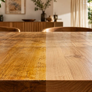
2. White and oakwood
This is a reliable choice for compact kitchens. White reflects light and makes the space feel bigger, while oakwood adds warmth and texture.
It creates a clean, minimal look that still feels comfortable and lived-in.

3. Light teal and wood
Teal brings a calm and refreshing feel to the kitchen. Teal Colour sits between blue and green, making it both soothing and lively.
When paired with wood, it creates a balanced look that feels modern but not too sharp. This works well if you want a subtle pop of colour.

4. Shades of black
An all-black kitchen can look sleek and contemporary. Different textures and finishes help add depth so the space does not feel flat.
To keep the kitchen from feeling too dark, introduce lighter elements through countertops or backsplash.

5. Black and wood
This combination brings together contrast and warmth. Black adds structure and definition, while wood softens the overall look.
It works especially well in modern kitchens where you want a strong yet welcoming design.

6. Warm brick, white and grey
If you want to add character, this mix is a great option. Brick tones bring warmth and a slightly rustic feel.
White and grey keep the space balanced and prevent it from looking heavy. Together, they create a kitchen that feels both fresh and grounded.

7. Grey and wood
For a softer and more understated look, grey and wood work beautifully together. Grey keeps the design clean, while wood adds natural warmth.
This combination suits both modern and traditional kitchens without feeling too bold.

8. Black and white
Black and white is a classic combination that always works. It creates strong contrast and a sharp, clean look.
You can use white as the main colour and black as an accent, or reverse it depending on how bold you want the space to feel.
Tips to get the colours right
Balance light and dark shades
Too many dark colours can make a compact kitchen feel smaller. Use lighter tones to open up the space.
Keep materials in mind
Cabinets, countertops, and backsplashes should work together. Try to repeat colours or tones for a cohesive look.
Use colour to guide the eye
In a parallel kitchen, consistent colours across both sides help the space feel organised and connected.
Final thought
A well-designed parallel kitchen is not just about layout. Colour plays a key role in how the space feels and functions every day.
With carefully chosen combinations and finishes from Asian Paints, you can create a kitchen that looks stylish, feels comfortable, and stands the test of time.
LIKE THIS ARTICLE
Give us a thumbs up!
TEXTURE FINISH
Royale Play special effects for the interior


Call us for Painting Services
 1800-209-5678
Are you looking for home interiors?
Get tailored made designs from our interior design services by asian paints.
Are you looking for home interiors?
Get tailored made designs from our interior design services by asian paints.
Fill the form below to book an appointment with an in house interior designer.