Find Contractor
 Profile
 {{minicart.cartcount > 0 ? minicart.cartcount : 0}}
Cart
↻ Processing...
You have {{minicart.cartcount}} items
-
₹ {{item["totalPrice"]["value"]}}


TRENDING
Interior Paint
Seasonal Colours
What Are Seasonal Colour Palette Trends for Home Interiors?
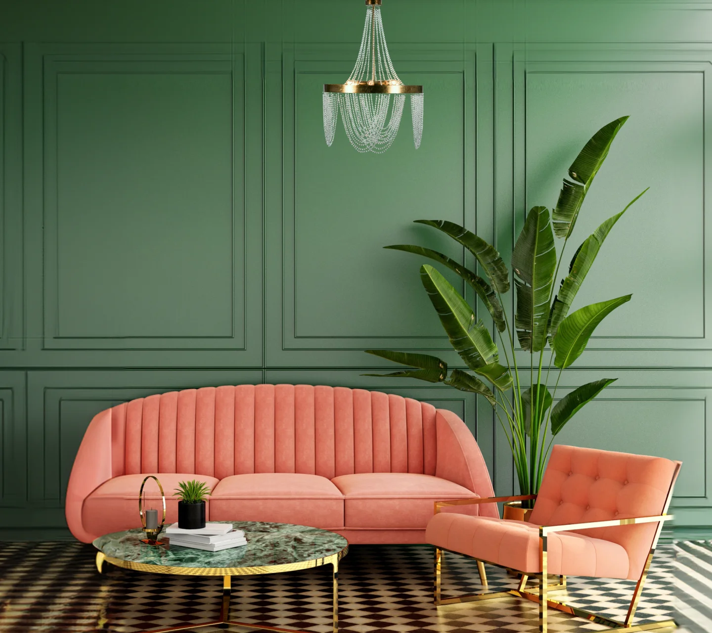
Colours can change the way a home looks and feels. The right shades can make a room feel brighter, more spacious, warm, or relaxing. Seasonal colour trends offer fresh ideas for updating your interiors without changing all your furniture or investing in a major renovation.
In 2026, home interiors can embrace warm neutrals, nature-inspired greens, earthy browns, muted terracotta, and soft pastels. The best choice depends on your personal style, room size, lighting, and existing décor. By combining trending shades with timeless colours, you can create a home that looks stylish throughout the year.
TABLE OF CONTENTS
Why Seasonal Colour Trends Matter in Interior Design
What Are the Latest Interior Paint Colour Trends and How Can I Apply Them in My Home This Year?
What Are Trending Colour Ideas for 2026 Interiors?
Seasonal Colour Palette Trends for Different Times of the Year
How to Choose a Seasonal Colour Palette for Your Home
Can a Colour Visualiser Help You Test Trending Shades Before Painting?
Best Seasonal Colour Combinations for Different Rooms
Common Mistakes to Avoid When Following Colour Trends
Expert Tips for Incorporating Seasonal Colour Trends Into Your Home
Why Seasonal Colour Trends Matter in Interior Design
How Seasonal Colours Influence the Look and Feel of a Home
Colours influence the mood and atmosphere of a room. Light shades can make compact spaces feel open, while deeper colours add warmth and character. Soft greens and blues often create a calm setting, whereas terracotta and warm beige bring a cosy feel.
Seasonal changes can inspire you to refresh your walls, cushions, curtains, and other accessories to suit the time of year.
Benefits of Refreshing Interiors With Current Colour Trends
Following colour trends gives you new ways to express your style and update an older interior. You do not need to repaint every wall. Changing an accent wall or adding accessories in a trending shade can make a noticeable difference.

Balancing Timeless Shades With Trend-Led Colours
Neutral shades such as white, cream, beige, and grey provide a lasting foundation. You can introduce seasonal colours through feature walls, artwork, rugs, and soft furnishings. This approach makes it easier to update your décor when your preferences change.
What Are the Latest Interior Paint Colour Trends and How Can I Apply Them in My Home This Year?
Trending Neutral Tones for Modern Homes
Warm white, sand, greige, and creamy beige are useful choices for modern homes. They create a comfortable backdrop for wooden furniture, natural fabrics, and decorative accents. These shades also work well in open-plan spaces where you want different rooms to feel connected.
Nature-Inspired Greens, Earthy Browns, and Warm Beiges
Nature-inspired colours continue to offer versatile options for home interiors. Sage green, olive, clay brown, and muted earthy tones can bring a natural feel indoors. Pair sage green walls with cream furniture or combine warm beige with wooden finishes for a balanced look.

Statement Colours for Accent Walls and Feature Areas
Deep blue, forest green, burgundy, and muted terracotta can add personality to a room. Use these shades on a single wall, behind a bed, or around a reading corner. Keeping the surrounding walls lighter helps maintain visual balance.
What Are Trending Colour Ideas for 2026 Interiors?
Warm Minimalist Colour Palettes
Warm minimalism combines simple interiors with comfortable colours. Think ivory walls, sandy beige, soft taupe, and light wood finishes. These shades create a clean appearance without making a room feel cold.
Muted Terracotta, Clay, and Desert-Inspired Shades
Terracotta, dusty rust, and clay pink add warmth without appearing too bright. They work particularly well with cream walls, wooden furniture, and woven textures. These shades can be used in living rooms, dining areas, and bedrooms.
Soft Pastels for Contemporary Spaces
Powder blue, pale pink, soft lavender, and mint green can make a room feel fresh and light. Use them with white or beige to avoid an overly colourful appearance. Pastels are especially suitable for bedrooms, children's rooms, and smaller spaces.

Bold Jewel Tones for Modern Luxury Interiors
Emerald green, sapphire blue, and plum can create a rich, sophisticated atmosphere. Pair them with neutral walls, warm lighting, or restrained metallic accents. These deeper shades work best when the room has enough light and the colour is used thoughtfully. These are useful directions for 2026 interiors rather than a fixed list of universally accepted trend rankings. Choose shades that suit your home and preferences.
Seasonal Colour Palette Trends for Different Times of the Year
Spring Colour Trends: Fresh Greens, Soft Yellows, and Florals
Spring-inspired palettes use sage green, pale yellow, and gentle floral shades to create a fresh appearance. Introduce these colours through cushions, curtains, artwork, or a light accent wall.
Summer Colour Trends: Coastal Blues and Bright Neutrals
Sky blue, sea green, ivory, and crisp white can make interiors feel airy. These combinations work well in rooms with plenty of natural light and suit relaxed, contemporary décor.
Autumn Colour Trends: Terracotta, Rust, and Earthy Browns
Autumn palettes feature warm browns, muted orange, rust, and terracotta. Pair these colours with cream walls and wooden furniture to create a welcoming living room or dining area.

Winter Colour Trends: Deep Blues, Forest Greens, and Rich Neutrals
Deep blue, forest green, and warm charcoal can add depth during cooler months. Balance them with ivory, beige, or soft lighting so the room remains comfortable rather than dark.
What Are Current Trends for Wall Painting Colours in Living Rooms and Bedrooms?
Popular Colour Combinations for Living Rooms
Living rooms benefit from colours that work with seating, flooring, and natural light. Consider these combinations:
Warm white and sage green: Fresh and natural.
Beige and terracotta: Warm and inviting.
Light grey and navy blue: Modern and sophisticated.
Cream and olive green: Relaxed and timeless.
Trending Bedroom Colours for Relaxation and Comfort
Bedrooms often work well with muted shades that create a restful atmosphere. Dusty blue with ivory, sage green with beige, and blush pink with warm white are useful combinations. Choose softer tones if you prefer a quiet, understated space.

Accent Wall Ideas for Contemporary Interiors
An accent wall can add interest without overwhelming the room. Try terracotta behind a neutral sofa, muted green behind a bed, or deep blue in a study area. Before choosing a strong shade, consider how it looks alongside your furniture and lighting.
How to Choose a Seasonal Colour Palette for Your Home
Understanding Natural Light and Room Orientation
Rooms that receive strong sunlight can support a wide range of colours. Rooms with limited natural light may benefit from warmer, lighter shades. Test your preferred colours in the room at different times of day before making a final decision.
Matching Trending Colours With Existing Furniture and Décor
Look at your sofa, wardrobes, flooring, curtains, and rugs before selecting paint. Choose colours that complement their undertones. For example, warm beige walls can work well with wooden furniture, while cool grey may suit furniture with a more contemporary finish.
Selecting Colours Based on Room Function
Use welcoming colours in social spaces, calming shades in bedrooms, and balanced neutrals in work areas. Kitchens can benefit from light, clean-looking shades, while dining areas can accommodate warmer colours.

Creating Flow Between Different Spaces
Choose a consistent base colour for connected rooms and introduce different accent shades where needed. This helps maintain a sense of continuity throughout your home without making every room look identical.
Can a Colour Visualiser Help You Test Trending Shades Before Painting?
How Colour Visualisation Tools Work
A colour visualiser allows you to preview paint shades digitally. Depending on the tool, you may be able to view selected colours on walls or explore combinations before purchasing paint.
Previewing Seasonal Colour Palettes in Real Rooms
Upload a room photograph if the tool supports it, then test colours against your furniture and existing finishes. A visualiser can help you narrow down options, although screen colours may not perfectly represent the final painted surface.

Comparing Multiple Colour Options Digitally
Compare a few palettes side by side. For example, test sage green against warm beige or compare terracotta with muted pink. You can also consult a physical colour shade card and paint a small sample area to see how the colour looks in real lighting.
What Are the Latest Trending Colours for Bangalore Apartment Interiors?
Popular Colours for Urban Apartment Living
Warm white, greige, sage green, muted blue, and earthy beige are versatile choices for contemporary apartments in Bangalore. They work with many furniture styles and can create a cohesive appearance across living and dining areas.
Space-Enhancing Shades for Compact Homes
Small apartments often benefit from lighter wall colours, such as ivory, cream, and pale greige. A darker accent wall can still work when balanced with light furniture and good lighting.

Climate-Friendly Colour Choices for Bangalore Homes
For homes that receive strong sunlight, consider how wall colours look throughout the day. Lighter shades may help a room feel visually bright, while earthy colours can add warmth to shaded spaces. Ventilation, insulation, and window treatments have a greater impact on thermal comfort than paint colour alone.
Best Seasonal Colour Combinations for Different Rooms
Living Room Colour Palette Ideas
Combine warm beige walls with olive green cushions or use ivory walls with a muted blue accent. These palettes suit many furniture styles and are easy to refresh with accessories.
Bedroom Colour Palette Ideas
Try sage green with cream, dusty blue with warm white, or soft terracotta with beige. These combinations add character while keeping the room comfortable.
Kitchen and Dining Room Colour Combinations
White and pale green can create a fresh kitchen, while cream and warm brown work well in dining areas. Choose finishes that are easy to clean and suitable for the room's conditions.

Home Office and Study Room Colour Trends
Soft green, muted blue, and warm grey can provide a balanced backdrop for work. Combine them with good lighting and minimal visual clutter to create a comfortable workspace.
Common Mistakes to Avoid When Following Colour Trends
Choosing Trends Without Considering Natural Lighting
A shade that looks beautiful in a bright showroom may appear different in your home. Always test colours in the actual room.
Using Too Many Trend Colours in One Space
Too many strong colours can make an interior feel disjointed. Choose one dominant shade, one supporting colour, and a smaller accent colour.
Ignoring Existing Furniture and Décor
Your paint choice should complement the items you already own. Consider their colours, textures, and finishes before deciding on a palette.

Prioritising Trends Over Long-Term Appeal
Trends change, but repainting can be expensive and time-consuming. Use versatile colours on large wall areas and reserve bolder seasonal shades for smaller features.
Expert Tips for Incorporating Seasonal Colour Trends Into Your Home
Start With Small Accent Areas
Try a feature wall, cushions, curtains, or artwork before committing to a strong colour throughout the room.
Combine Trend Colours With Timeless Neutrals
Neutral walls allow you to experiment with seasonal shades without changing your entire interior.
Use Textures and Accessories to Reinforce the Palette
Wood, linen, cotton, woven baskets, and textured rugs can complement your colour scheme and add depth to the room.

Refresh Colour Schemes Without Major Renovation
You can update your interiors by changing soft furnishings, adding artwork, repainting a small area, or introducing plants. These simple changes help keep your home feeling fresh throughout the year.
Frequently Asked Questions
1. What are the latest interior paint colour trends and how can I apply them in my home this year?
Warm neutrals, nature-inspired greens, earthy browns, terracotta, and soft pastels are useful choices for 2026 interiors. Apply them through accent walls, selected rooms, or accessories that complement your existing décor.
2. What are trending colour ideas for 2026 interiors?
Warm minimalist palettes, muted clay shades, soft pastels, and rich jewel tones offer different ways to style a home. Choose based on your room's lighting, size, and overall design.
3. What are current trends for wall painting colours in living rooms and bedrooms?
Living rooms often suit beige, sage green, warm white, and muted blue. Bedrooms can feel restful with dusty blue, soft green, blush pink, and cream.
4. What are the latest trending colours for Bangalore apartment interiors?
Warm white, greige, sage green, muted blue, and earthy beige are versatile options for Bangalore apartments. Consider natural light, room size, and existing furniture when selecting shades.
5. Which seasonal colour palette works best for small apartments?
Light neutrals paired with one or two muted accent colours can help small apartments feel open and coordinated. Use darker shades selectively.
6. How do I choose a trending colour palette that matches my furniture?
Identify the dominant colours and undertones in your furniture, then choose complementary wall shades. Test samples in your room before painting.
7. Can seasonal colour trends work in traditional homes?
Yes. Terracotta, olive green, cream, warm beige, and muted gold can complement traditional furniture and decorative details while giving interiors a fresh look.
8. How often should I update my home's colour palette to stay on trend?
There is no need to repaint every season. Refresh accessories whenever you like, and repaint when the walls need maintenance or you want a lasting change.
LIKE THIS ARTICLE
Give us a thumbs up!
TEXTURE FINISH
Royale Play special effects for the interior


Call us for Painting Services
 1800-209-5678
Are you looking for home interiors?
Get tailored made designs from our interior design services by asian paints.
Are you looking for home interiors?
Get tailored made designs from our interior design services by asian paints.
Fill the form below to book an appointment with an in house interior designer.