

TRENDING
Wall Colour Ideas
Painting services
How to Test a Paint Colour Before You Buy: Sample Pots, Lighting and Wall Patches
Choosing a wall paint colour is one of the most exciting parts of refreshing a home. Whether you are looking for a calming bedroom shade, a welcoming living-room colour or a bold accent wall, the right paint colour for walls can transform the look and feel of a space.
However, a shade that looks perfect on a paint colour chart may appear different once it is applied to your walls. Lighting, room size, flooring and furnishings can all influence how a colour is perceived. Testing your preferred shades before committing to the full paint job is therefore a simple way to make a more confident choice.
TABLE OF CONTENTS
Why Testing Paint Colours Before Buying Matters
Why Paint Colours Look Different in Real Homes
Understanding Paint Samples and Sample Pots
How to Test Paint Colours Correctly
The Best Locations to Create Paint Test Patches
How Lighting Changes Paint Colour Appearance
Testing Paint Colours Throughout the Day
How Existing Room Elements Affect Paint Colour
How Colour Consultants and Professional Painters Test Shades
Why Testing Paint Colours Before Buying Matters
Why Colour Cards Are Not Always Accurate
A paint colour chart is a useful starting point for exploring shades, but a small printed or painted swatch cannot fully reproduce how a colour will look across a large wall. The surrounding colours, lighting and surface can all change its appearance.

The Cost of Choosing the Wrong Paint Colour
Repainting takes additional time, material and effort. Testing a few shortlisted shades first can help you avoid choosing a colour that feels too dark, bright, warm or cool once it covers the entire room.
Why Paint Colours Look Different in Real Homes
Natural Light Variations
Sunlight changes throughout the day. A colour may appear brighter in direct morning light and softer later in the day. Walls facing different directions can also receive different levels of natural light.
Artificial Lighting Effects
Warm bulbs can make some colours appear more yellow or cosy, while cool white lighting can make certain shades appear sharper or cooler. Consider the lighting you actually use in the room when evaluating your home paint colour.

Surrounding Décor and Furnishings
Furniture, flooring, curtains and décor can influence how a wall colour appears. A neutral shade can look warmer next to wooden furniture and cooler alongside grey or blue furnishings.
Understanding Paint Samples and Sample Pots
What Are Sample Pots?
Sample pots are smaller quantities of paint that allow homeowners to apply a colour to a limited area before purchasing paint for the complete room. They are particularly useful when you are deciding between similar shades.
Asian Paints offers colour exploration tools and a wide range of interior shades, making it easier to shortlist colours before finalising your choice. The Asian Paints Colour Catalogue and colour tools can help you explore possibilities for different rooms and design preferences.
When Sample Pots Are Worth Using
Sample testing is especially useful when choosing between closely related neutrals, strong colours or shades that may respond differently to your room's lighting. It can also help when you are coordinating a new shade with existing flooring or furniture.

How Much Area Should Be Tested?
Test a sufficiently large area so you can see the colour clearly from different parts of the room. A larger patch provides a better indication of how the shade will look when used across the wall.
How to Test Paint Colours Correctly
Choosing the Right Test Wall
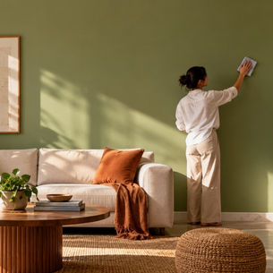
Choose a wall that receives the type of light typical of the room. If possible, test the colour on a primary wall as well as a wall exposed to different lighting conditions.
Creating Large Paint Patches
Small swatches can make it difficult to judge the overall effect. Create reasonably large patches and apply the paint evenly so you can assess the colour and finish more accurately.

Testing More Than One Shade at a Time
Shortlist two or three shades and place them with enough separation to evaluate each individually. Testing too many colours together can make comparison difficult.
For a convenient way to visualise colours, Asian Paints ColourNext and its colour resources offer inspiration and curated colour ideas that can help narrow your selection.
The Best Locations to Create Paint Test Patches
Primary Walls
Testing a main wall gives you a clearer sense of how the colour will influence the room as a whole.
Walls Facing Windows
A wall near or opposite a window can reveal how natural daylight affects the shade. This is particularly useful for rooms with large windows.

Accent Walls
If you are considering a feature wall, test the shade specifically on that wall. An accent colour can look considerably stronger when viewed across a larger surface.
How Lighting Changes Paint Colour Appearance
Morning Light vs Afternoon Light
Morning sunlight can make colours appear fresh and brighter, while afternoon light may create warmer or deeper impressions depending on the room's orientation.
Warm Artificial Lighting
Warm lighting can enhance reds, yellows, beiges and other warm tones, creating a cosy atmosphere. It may also make some neutral shades appear warmer than expected.

Cool White Lighting
Cool white lighting can make blues, greens and certain greys appear more pronounced. Always consider your existing light sources before finalising an interior paint shade.
Testing Paint Colours Throughout the Day
Daylight Evaluation
Observe your sample in natural daylight and see how it responds to brighter and softer periods of sunlight.
Evening Evaluation
Switch on the room's usual lights and assess the sample again. A shade that looks ideal during the day may create a different mood in the evening.
Seasonal Lighting Considerations
Natural light can vary with weather, season and the amount of sunlight entering the room. If you are making a major colour decision, consider how the space looks under different typical conditions.
How Existing Room Elements Affect Paint Colour
Flooring Materials and Colours
Wood, marble, tiles and carpets can each influence the perceived undertone of a wall colour. Compare your sample with the flooring before making your final decision.
Furniture and Upholstery
Existing sofas, beds, cabinets and upholstery should form part of your colour evaluation. Your chosen shade should complement rather than compete with these elements.

Curtains and Soft Furnishings
Curtains, rugs and cushions can introduce additional colours into the room. Testing your sample alongside these elements can help create a more coordinated look.
How Colour Consultants and Professional Painters Test Shades
Large Sample Applications
Professional painters and colour consultants can help assess shortlisted shades using larger applications, allowing homeowners to understand how a colour behaves on the actual surface.
Room-Wide Colour Assessment
For homeowners who want more personalised guidance, Asian Paints offers professional painting services through Asian Paints Beautiful Homes Painting Services, with colour consultation and painting assistance designed to simplify the home painting process.
With the right guidance, you can explore home painting ideas, compare shades and select a colour that complements your home's lighting, architecture and décor.
Frequently Asked Questions
How large should a paint test patch be?
A large patch is preferable to a tiny swatch because it gives you a better understanding of the colour's overall appearance. Where possible, evaluate the shade across a substantial section of the wall.
How many paint colours should I test at once?
Testing two or three shortlisted colours is usually enough for an effective comparison. Once you narrow your options, evaluate the final choice more closely.
Should I test paint colours on multiple walls?
Yes, particularly when the room receives significantly different lighting on different walls. Testing more than one location can reveal changes in colour perception.
Why does the same paint colour look different during the day?
The intensity, direction and colour temperature of natural and artificial light change throughout the day. As a result, the same wall colour can appear brighter, warmer, cooler or deeper at different times.
Do paint finishes affect how colours appear?
Yes. Different finishes reflect light differently and can influence the perceived depth and appearance of a colour. Consider both the shade and the finish when making your final selection.
How long should I observe a paint sample before making a decision?
Ideally, observe the sample at different times of the day and under the lighting you normally use. This gives you a more complete picture of how the wall colour will look in everyday conditions.
A little testing before painting can make a big difference. Explore your favourite shades, observe them in your actual space and consider your home's existing elements before making the final choice. With the wide range of Asian Paints colours, finishes and professional painting services available, finding the right home paint colour can be a more informed and enjoyable part of transforming your home.
LIKE THIS ARTICLE
Give us a thumbs up!
TEXTURE FINISH
Royale Play special effects for the interior


Call us for Painting Services
 1800-209-5678
Are you looking for home interiors?
Get tailored made designs from our interior design services by asian paints.
Are you looking for home interiors?
Get tailored made designs from our interior design services by asian paints.
Fill the form below to book an appointment with an in house interior designer.