

TRENDING
Wallpapers
Accent Wallpaper
How to Match Wallpapers with Existing Furniture and Décor
Choosing the right wallpaper can change the look and feel of a room. However, finding a design that works with your existing furniture, curtains, flooring, and wall paint can feel confusing. A wallpaper that looks beautiful in a showroom may not always suit your home. The key is to choose colours, patterns, and textures that complement what you already have.
Whether your home has modern furniture, traditional wooden pieces, or a simple minimalist style, the right wallpaper can bring everything together. With a little planning, you can create a room that feels balanced, comfortable, and inviting without replacing your existing décor.
TABLE OF CONTENTS
Why Wallpaper and Furniture Coordination Matters
How Do I Match a Wallpaper Design With the Rest of My Room's Paint?
How to Choose Colours for a Wall to Match My Furniture and Décor
Choosing Wallpaper Based on Furniture Style
Can a Visualiser Help Me Match My Furniture With Wall Colours?
Best Wallpaper Colours for Different Furniture Finishes
Common Wallpaper Selection Mistakes to Avoid
Why Wallpaper and Furniture Coordination Matters
How a Well-Matched Room Creates Visual Harmony
Wallpaper and furniture should work together to create a consistent look. When their colours and styles complement each other, the room feels more organised and welcoming. For example, a soft beige wallpaper can make dark wooden furniture look elegant, while a subtle grey design can complement a modern sofa.
Common Wallpaper and Furniture Matching Mistakes
One common mistake is choosing wallpaper based only on its appearance without considering the rest of the room. Bright patterns may clash with colourful upholstery, while dark wallpaper can make a small room feel enclosed. Choosing too many patterns can also make the space look busy. Always consider the furniture, lighting, and size of the room before making a decision.

Balancing Colours, Textures, and Patterns Effectively
A simple approach is to let one element stand out while keeping the others understated. If your sofa has a bold pattern, choose wallpaper with a subtle texture or a small design. If your furniture is plain, you can experiment with a floral wallpaper, geometric wallpaper, or decorative wallpaper. This balance helps create an attractive and comfortable space.
How Do I Match a Wallpaper Design With the Rest of My Room's Paint?
Using Existing Wall Colours as a Starting Point
Start by looking at the paint colours already used in your room. If most walls are white, cream, or light grey, choose wallpaper that complements these shades. You can select a similar colour for a calm appearance or introduce a deeper shade to create an accent wall.
Matching Warm and Cool Colour Tones
Warm colours include cream, beige, terracotta, and warm brown. Cool colours include blue, cool grey, and certain shades of green. Matching similar undertones usually creates a more harmonious look.
Here are some colour combinations to consider:
Beige paint with sage green wallpaper: Creates a calm, natural atmosphere.
White paint with navy blue wallpaper: Adds depth and contrast to a modern room.
Light grey paint with blush pink wallpaper: Gives the room a soft, contemporary feel.
Cream walls with brown patterned wallpaper: Works well with traditional wooden furniture.
Pale blue paint with white and grey wallpaper: Creates a fresh, airy appearance.

Choosing Complementary Wallpaper Colours and Patterns
Look at the colours in your curtains, cushions, rugs, and artwork. Choosing wallpaper that repeats one of these colours creates a natural connection between different elements. For instance, wallpaper with soft green details can complement green cushions and indoor plants.
How to Choose Colours for a Wall to Match My Furniture and Décor
Identifying the Dominant Colours in Your Furniture
Begin with your largest furniture pieces, such as the sofa, bed, wardrobe, or dining table. Notice their main colours and undertones. If your furniture is already dark or colourful, lighter wallpaper can balance the room. If your furniture is neutral, you have more freedom to experiment with bolder designs.
Coordinating Wallpaper With Upholstery, Curtains, and Rugs
Your wallpaper does not need to match every furnishing exactly. Instead, look for colours that complement each other. For example, a cream wallpaper with delicate brown patterns can work beautifully with beige curtains and a wooden coffee table. Repeating one or two colours across cushions, rugs, and wallpaper can make the room feel connected.

Creating Contrast Without Overpowering the Space
Contrast adds interest when used carefully. In a living room with a charcoal sofa, a light wallpaper with subtle geometric patterns can brighten the space. In a bedroom with a beige upholstered bed, muted green or dusty pink wallpaper behind the headboard can create a relaxing focal point.
The goal is to make the furniture and walls complement each other rather than compete for attention.
Choosing Wallpaper Based on Furniture Style
Wallpapers for Modern and Contemporary Furniture
Modern furniture often features clean lines, simple shapes, and neutral colours. Geometric designs, subtle metallic details, and textured wallpapers work well with this style. Grey, white, beige, and muted blue are useful choices for creating a contemporary appearance.
Wallpapers for Traditional and Classic Interiors
Traditional furniture often includes carved wooden details, rich finishes, and decorative fabrics. Floral patterns, classic motifs, and warm colours such as cream, olive green, and muted gold can complement these pieces. Choose a design that matches the furniture's level of detail without making the room feel crowded.
Wallpapers for Minimalist Décor Themes
Minimalist rooms look best when the design feels simple and uncluttered. Plain textures, delicate lines, and soft neutral shades can add character without overwhelming the space. Wallpaper in off-white, light grey, or warm beige can create depth while preserving the clean look.

Wallpapers for Luxury and Statement Furniture Pieces
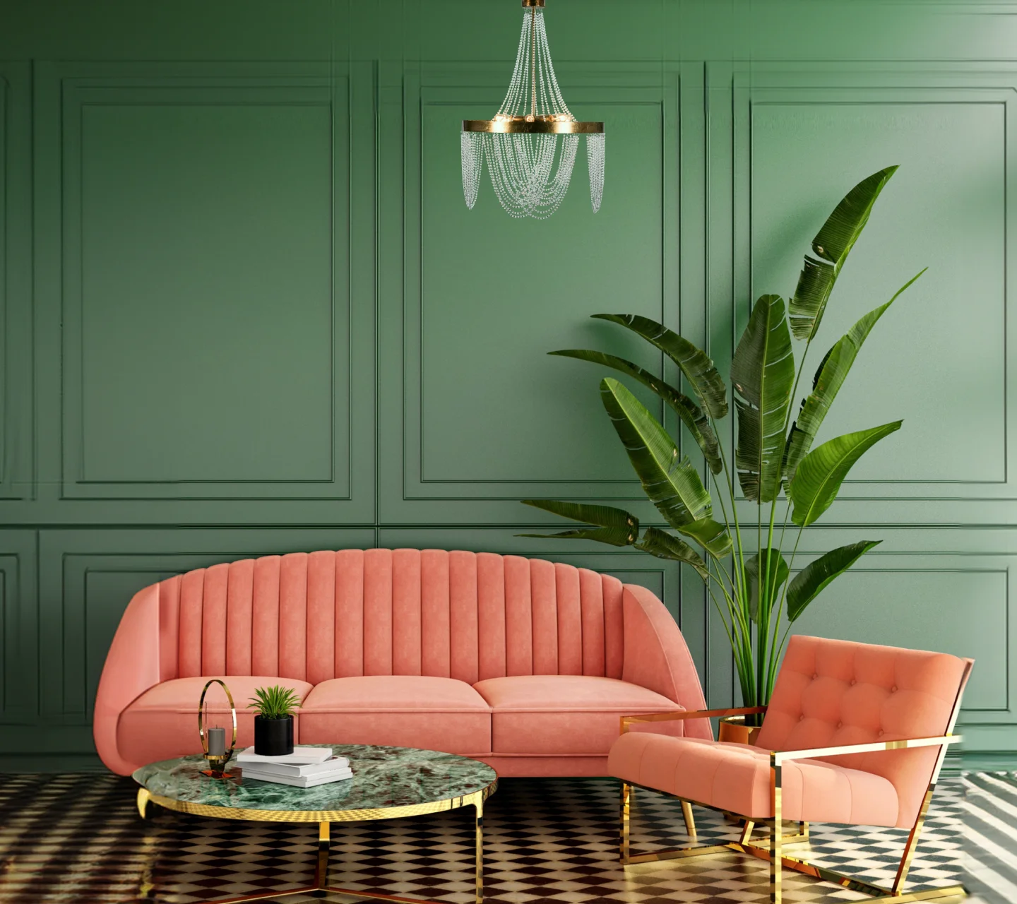
If your room already has a statement sofa, designer lighting, or an ornate bed, choose wallpaper that supports rather than competes with it. Subtle marble effects, elegant textures, or understated metallic patterns can create a refined finish.
How to Select Wallpaper Patterns That Complement Existing Décor
Large Patterns vs Small Patterns for Different Room Sizes
Large patterns can make a bold statement, especially on a single accent wall in a spacious room. Smaller patterns often work well in compact rooms because they can add detail without dominating the space. However, lighting, colour contrast, and furniture placement also affect how large or small a room feels.
Matching Geometric, Floral, and Textured Designs
Geometric wallpaper suits modern furniture, while floral designs can complement traditional or soft, romantic interiors. Textured wallpaper works well when you want to add interest without introducing strong colours or busy patterns.
Using Accent Wallpapers Without Overcrowding the Space
An accent wall is an effective way to introduce wallpaper without covering every wall. The wall behind a sofa or bed is often a good choice. Keep the remaining walls in complementary paint shades so the wallpaper remains the main feature.

Creating Visual Balance Between Furniture and Wall Designs
If your furniture has bold colours or busy prints, choose simpler wallpaper. If your furniture is plain, a more decorative design can add personality. This approach helps your wallpaper and furnishings work together naturally.
Can a Visualiser Help Me Match My Furniture With Wall Colours?
How Digital Visualisers Simplify Colour Selection
A digital visualiser allows you to preview different colours and finishes before making a final choice. It can help you compare options and understand how a particular palette might look in your room.
Uploading Room Images to Test Wallpaper and Colour Combinations
Some design tools allow you to upload a room photograph and experiment with wall colours or available designs. Use a clear photograph that shows your furniture and existing décor. Remember that screen colours may differ from the actual wallpaper, so check physical samples before purchasing.

Comparing Multiple Design Options Before Finalising
Try comparing two or three combinations instead of exploring too many options at once. Look at how each design works with your sofa, curtains, flooring, and natural light. This makes it easier to narrow down your choices.
Can Asian Paints Help Choose a Living Room Palette to Match Modern Furniture in Chennai?
Understanding Regional Design and Colour Preferences
Homes in Chennai may feature a range of interior styles, from contemporary apartments to traditional homes with wooden furniture. Natural light, room size, and personal preferences all influence which colours work best.
Creating Coordinated Colour Palettes for Modern Living Rooms
For a modern living room, consider warm white walls with beige or grey wallpaper and a few deeper accents. Sage green, muted blue, and earthy brown can also complement neutral furniture while adding character.

Combining Wallpapers, Paints, and Furnishings Seamlessly
Asian Paints offers interior colour and décor solutions that homeowners can explore when planning a coordinated room design. Its available wallpaper collections, colour consultation services, and visualisation tools can help you compare options, where offered. Check the current service availability in Chennai before booking a consultation.
Best Wallpaper Colours for Different Furniture Finishes
Wallpaper Ideas for Wooden Furniture
Wooden furniture pairs well with cream, beige, olive green, and soft grey wallpaper. Light shades can balance dark wood, while warm earthy colours can enhance the natural appearance of lighter wooden finishes.
Wallpaper Pairing Tips for White and Neutral Furniture
White furniture works with many wallpaper styles, including pastel florals, soft geometric patterns, and textured neutrals. For a warmer appearance, try cream or sand shades. For a contemporary look, consider pale grey or muted blue.
Wallpaper Colours for Dark-Coloured Furniture
Dark brown, black, or charcoal furniture often looks striking against lighter walls. Beige, ivory, and pale grey wallpaper can create contrast, while muted green or deep blue can produce a richer look when the room has enough light.

Wallpaper Designs for Metal and Glass Furniture
Metal and glass furniture usually suits modern interiors. Geometric patterns, concrete effects, and subtle metallic finishes can complement these materials. Keep the design simple if the furniture already has reflective surfaces or distinctive shapes.
Common Wallpaper Selection Mistakes to Avoid
Ignoring Existing Furniture Colours
Always consider your largest furniture pieces before selecting wallpaper. A design that looks attractive on its own may not work with your current colour scheme.
Choosing Too Many Competing Patterns
Combining patterned curtains, printed upholstery, decorative rugs, and bold wallpaper can make a room feel overwhelming. Let one or two elements stand out while keeping the rest relatively simple.
Overlooking Room Lighting Conditions
Natural and artificial lighting can change how wallpaper colours appear. Dark shades may look richer in bright rooms but heavier in spaces with limited light. Check samples at different times of the day before deciding.

Selecting Wallpaper Without Considering Future Décor Changes
If you plan to replace your sofa, curtains, or furniture soon, choose a wallpaper colour that will work with different styles. Neutral shades and subtle patterns usually offer greater flexibility.
Expert Tips for Creating a Cohesive Interior Design Scheme
Following the 60-30-10 Colour Rule
A useful starting point is the 60-30-10 rule. Use your main colour across roughly 60% of the room, a secondary colour across 30%, and an accent colour across 10%. These proportions are a guideline rather than a strict rule, but they can help maintain balance.
Layering Colours and Textures Successfully
Combine smooth painted walls with textured wallpaper, soft cushions, wooden furniture, and woven rugs. Different textures add depth even when the colour palette remains simple.
Using Wallpaper as a Focal Point
Choose a wall that naturally attracts attention, such as the wall behind your bed or sofa. A well-placed wallpaper design can give the room character without requiring major changes to the rest of the décor.

Planning Future Décor Updates Around Wallpaper Choices
Before finalising your wallpaper, consider whether it will still work if you change your curtains, cushions, or furniture. A versatile design makes future updates easier and helps you avoid unnecessary expense.
Frequently Asked Questions
How do I match a wallpaper design with the rest of my room's paint?
Choose wallpaper that shares a colour or undertone with your existing paint. You can use similar shades for a subtle look or contrasting colours for an accent wall. Always check samples in your room's lighting.
How can I choose colours for a wall to match my furniture and décor?
Start with the dominant colour of your sofa, bed, or other large furniture. Select complementary wallpaper that also works with your curtains, rugs, flooring, and accessories.
Can a visualiser help me match my furniture with wall colours?
Yes. A digital visualiser can help you preview different colour combinations and compare designs before making a purchase. Physical samples are still useful for checking the actual colour and texture.
Can Asian Paints help choose a living room palette to match modern furniture in Chennai?
You can explore Asian Paints' available colour consultation and décor services to find suitable combinations for your living room. Confirm which wallpaper and visualisation services are currently available in Chennai.
What wallpaper colours work best with wooden furniture?
Cream, beige, olive green, warm grey, and earthy shades generally complement wooden furniture. The best choice depends on the wood's colour and undertone.
Should wallpaper match my curtains and upholstery?
They do not need to match exactly. Choose complementary colours or repeat one shade across the wallpaper, curtains, and upholstery to create a coordinated look.
How do I choose wallpaper for small rooms with large furniture?
Choose lighter colours, subtle patterns, or delicate textures to help the room feel open. An accent wall can also add interest without making every wall visually busy.
Can I combine wallpaper and painted walls in the same room?
Yes. Wallpaper on one accent wall and complementary paint on the remaining walls can create a balanced and attractive interior.
LIKE THIS ARTICLE
Give us a thumbs up!
TEXTURE FINISH
Royale Play special effects for the interior


Call us for Painting Services
 1800-209-5678
Are you looking for home interiors?
Get tailored made designs from our interior design services by asian paints.
Are you looking for home interiors?
Get tailored made designs from our interior design services by asian paints.
Fill the form below to book an appointment with an in house interior designer.