Colour Psychology
Study Room Design
Top Study Room Colour Combinations to Boost Focus and Productivity
A good study room does more than hold books and a desk. It sets the mood for learning, thinking, and creating ideas. Walk into the right space and your mind feels alert yet calm. That feeling often starts with colour.
Colours influence how we think and feel, sometimes without us even realising it. Some shades help the mind stay focused, while others can quietly distract. That is why choosing the right study room colour combination matters, especially if the space is used every day.
Based on colour psychology and Vastu principles, here are some study room colour combinations that help you stay motivated and mentally fresh.
Best Colour Combinations for Study Rooms

1. Cream and White for a Calm Start
Cream and white colour create a soft, welcoming study environment. These shades reflect light gently and reduce eye strain, which helps during long reading or work sessions.
This combination suits both large and small rooms. Add wooden furniture or neutral décor to keep the space warm and balanced.

2. Beige and White for a Modern Study
Choose beige and white if you want a clean and contemporary study room. Beige adds warmth, while white keeps the room open and clutter-free.
This pairing works especially well in compact spaces. It makes the room feel larger and more organised, which helps clear the mind.

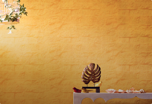
3. Yellow and White for Energy and Clarity
Yellow brings in optimism and mental energy. When you pair it with white, the space feels lively without becoming overwhelming.
Use yellow on one wall or in accents to lift the mood. This colour combination works well for children’s study rooms and creative workspaces.

4. Lavender and Grey for a Peaceful Setting
Lavender relaxes the mind, while grey colour adds structure and balance. Together, they create a calm and focused study environment.
This combination suits both students and professionals. It feels soothing yet stylish, making it ideal for long hours of work.

5. Cedar Green and Coffee Brown for a Natural Feel
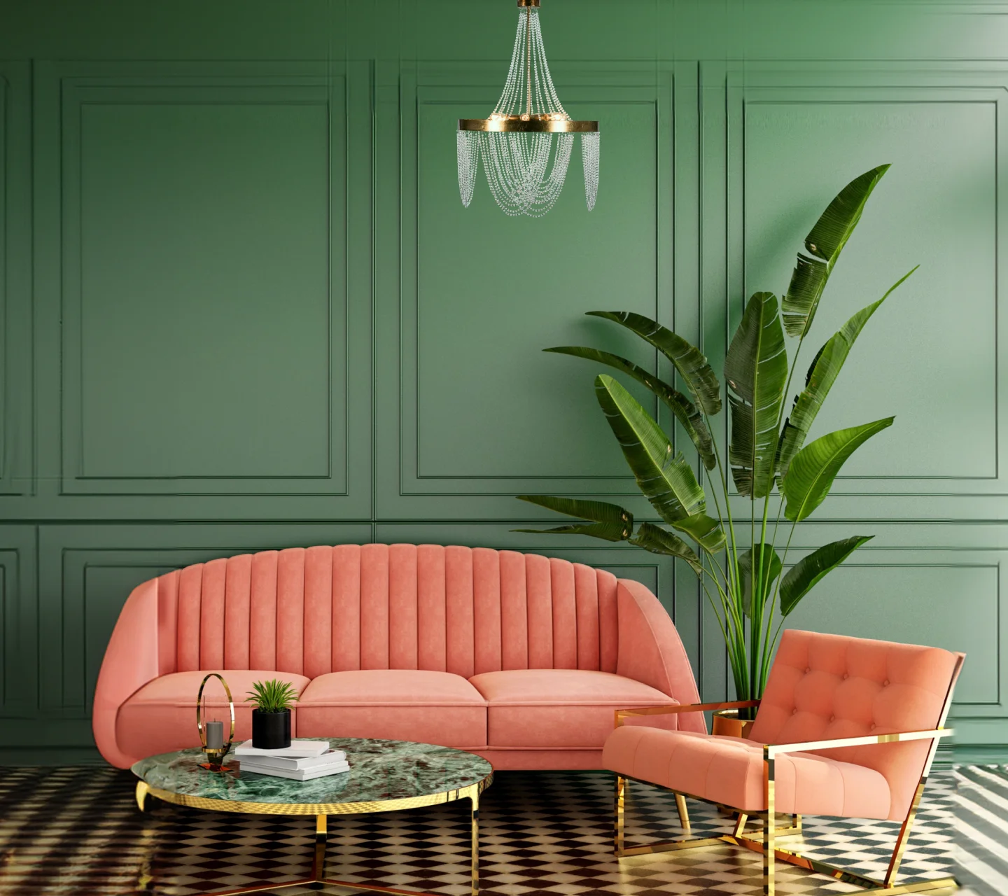
Bring the outdoors into your study room with cedar green and coffee brown. Green supports concentration and reduces stress. Brown adds warmth and stability.
This combination feels grounded and comforting. It works well for late-night study sessions and reading corners.

6. White and Ultramarine Blue for Fresh Focus
White and ultramarine blue create a crisp and refreshing study space. Blue encourages calm thinking, while white keeps the room bright and airy.
This combination fits well when the study area is part of a bedroom or shared space. It looks modern and feels organised.

7. Red and White for Controlled Energy
Red activates the mind and boosts alertness. When paired with white, it stays balanced and purposeful.
Use red in small doses, such as a feature wall or furniture accents. This approach keeps the space energetic without causing distraction.

8. Pale Green and Grey for Everyday Comfort
Pale green calms the eyes, while grey adds a modern edge. This combination creates a study room that feels relaxed yet focused.
It suits daily use and works well with minimal furniture and soft lighting.

9. White and Oak for a Timeless Study
White walls paired with oak or wood finishes create a warm and elegant study room. The space feels open, organised, and inviting.
This combination works best in larger study rooms or home offices where comfort and style matter equally.

10. Dark Brown and Off White for a Professional Look
Dark brown adds depth and seriousness, while off white keeps the room from feeling heavy. Together, they create a strong and refined study environment.
This pairing suits home offices or study rooms meant for deep concentration and structured work.
Best and Worst Colours for Study Rooms as per Vastu
Vastu recommends colours that support calm thinking and clarity.
Best choices include:
Light green, soft blue, white, cream, and pale yellow
Colours to avoid:
Black, very dark red, and heavy shades that make the space feel closed or dull
FAQs on Study Room Colour Combinations
1. How many colours should a study room have?
Stick to two or three complementary colours. This keeps the space visually calm and organised.
2. Which colours work best for a study room according to Vastu?
Light blues, greens, and whites help improve focus and mental balance.
3. Do colours really affect studying?
Yes. The right colours can improve concentration, reduce stress, and support productivity.
4. Which colours should you avoid in a study room?
Avoid very dark or overly bright colours that can feel distracting or tiring over time.
LIKE THIS ARTICLE
Give us a thumbs up!

TEXTURE FINISH


