↻ Processing...
You have {{minicart.cartcount}} items
-
₹ {{item["totalPrice"]["value"]}}
Your cart is empty
- Concepts & Theory
- Mastering Colour Selection
- Colour Psychology
- Colour Inspiration
- Colour of the Year
- Colour Shastra
- Interior Painting
- Exterior Painting
- Mixing And Matching Colours
- How can Asian Paints help you with Colour Selection?
Wall Colour Selection Guide
Concepts & Theory
Choosing the perfect colours for your home is a fundamental interior design element. The colours you decide on will influence the overall mood and ambiance of your living spaces, making it essential to approach this task with care and consideration. Whether you're looking to create a serene sanctuary or a vibrant, energetic atmosphere, a solid understanding of these principles will guide you toward achieving your vision. Also to ensure that you make informed decisions when selecting colours for your home, it is crucial to have a solid grasp of colour concepts, colour theory, the importance of colours, and the colour wheel.
Selection of Colour through Colour Concept, Theory and Wheel
Selecting the right colours for your home is a crucial aspect of interior design. The colours you choose can have a significant impact on the mood and atmosphere of your living space. To make informed decisions when selecting colours for your house, it's essential to understand colour concepts, colour theory, and the colour wheel. These tools can help you create a harmonious and visually appealing environment.
1. Using Colour Concept

Before diving into colour theory and the colour wheel, it's essential to grasp the importance of colours and the fundamental colour concepts -
Hue
Hue is what we typically think of when we describe a colour or when we ask someone, "What colour is that?". It is the pure essence of colour, representing the name of the colour itself, such as red, blue, or green. These hues are then used to form variations of shades of colours.
Example: If you want to paint your kitchen, you can choose between the hue red for a vibrant look, or the hue blue for a more serene atmosphere.

Saturation
Saturation is the colour intensity meaning how intense or muted a colour appears. Highly saturated colours are bold and strong, while desaturated colours are softer and more toned down.
Example: Imagine you're selecting a colour for your bedroom. A highly saturated royal blue will make a bold statement, while a desaturated pastel blue will create a more calming, muted color effect.

Value
Value refers to how light or dark a colour is. Light values are closer to white, while dark values are closer to black. Value helps create contrast and balance in a space.
Example: When picking a colour for your living room, a light value, like pale gray, can make the room feel open and airy, while a dark value, like charcoal gray, can add coziness and depth.

Temperature
Temperature defines the colour intensity whether it is warm or cool. Warm colours, like red and yellow, create a sense of warmth and energy, while cool colours, like blue and green, evoke a feeling of calm and relaxation.
Example: For a welcoming and inviting dining room, you might opt for warm hues like red or gold. In a home office where concentration is essential, cool colours like soft blues or greens can be a better choice.

2. Using Colour Theory
Now that we’ve covered the concepts let’s understand how we can use colour concepts and colour theory wheel to help you make a decision about your paint colour and create harmony and balance in your house -

Colour Schemes:
Colour schemes are pre-determined combinations of colours that work well together. Some common colour schemes include complementary (opposite colours on the colour theory wheel), analogous (colours adjacent on the colour theory wheel), and monochromatic (Varying shades and tones of a single colour) Choosing a colour scheme can help create a unified look for your space.
Psychology of Colour:
Colours can influence our emotions and behavior. For example, blues and greens are associated with calm and tranquility, while reds and yellows can evoke energy and excitement. Consider the emotional impact you want to achieve in each room.
Balance:
Achieving balance in your colour scheme is essential. You can use the 60-30-10 rule, where 60% of the room's colour is the dominant hue, 30% is a secondary colour, and 10% is an accent colour. This ensures a visually appealing and harmonious composition.
For example, In a living room, you might choose beige as the main colour for 60% of the space (walls and large furniture). For the supporting colour (30%), a soft gray for the curtains, couch, and chairs. For the 10% accent colour, throw in vibrant teal or orange pillows, artwork, and decorations.
In case you're still a bit confused after reading this section, let us give you some simple schemes based on the colour theory wheel:
3. Colour Combinations from the Colour Theory Wheel

The color theory wheel is a tool that organizes colors in a circular format. It's a valuable resource for understanding the importance of colours relationships and creating harmonious palettes. Here's how the colour theory wheel can help you select colours for your home:
Complementary Colors:
Colors opposite each other on the colour theory wheel, create strong contrast and vibrancy. Using complementary colors can make a bold statement in your design.
Example: Red and green for a festive holiday-themed room.

Analogous Colors:
Colors adjacent to each other on the colour theory wheel, such as blue, green, and teal, offer a harmonious and soothing color effect. These colors work well together and can create a unified look in your home.
Example: Shades of blue, such as navy, sky blue, and teal, for a calming beach-themed bedroom.

Triadic Colors:
Triadic colour schemes involve three equally spaced colours on the wheel, creating a balanced yet dynamic palette.
Example: A room with purple walls, orange furniture, and green accents for an energetic, yet balanced atmosphere.

Split-Complementary Colours:
This scheme involves a base colour and two adjacent colours to its complementary colour. It offers a balanced contrast and is less intense than a full complementary scheme.
Example: Pale yellow walls, with red-orange and green accents for a cheerful and balanced kitchen.

As an amateur sticking to the colour wheel might be the best idea, but if you want to learn a bit more and create the perfect colour combination like any professional, then let’s learn about how you can use professionals to use colour principles.
Call us for Painting Services
![]() 1800-209-5678
1800-209-5678
Let our experts help you!
XAre you looking for home interiors?
Get tailored made designs from our interior design services by asian paints.
Are you looking for home interiors?
Get tailored made designs from our interior design services by asian paints.
Mastering Colour Selection
Mastering Color Selection Like a Pro

In the realm of colours, professionals rely on fundamental principles of color theory, which include Colour Balance, Colour Harmony, and Colour Rhythm. These principles of color theory are essential for achieving the perfect colour combinations.
Colour Balance
Achieving balance in a room by distributing colour evenly. This ensures no single colour dominates the space.
Example: In a dining room with deep blue walls, balance the richness by adding a neutral, like a cream-coloured tablecloth and wooden furniture.
Colour Harmony
Combining colours pleasingly, often following established colour schemes.
Example: To create a harmonious look in a home office, use an analogous colour scheme with soft greens and blues for the walls, furniture, and decor.
Colour Rhythm
Repeating certain colours or patterns in a room creates a sense of rhythm and visual interest.
Example: In a bedroom with a neutral colour scheme, add colour rhythm by using the same accent colour for the bedding, curtains, and chair for a cohesive and visually engaging look.
Although the above four principles of color theory define the basics that you need to know about colour selection, let's delve a little bit deeper into how the psychology of colours can affect your mood.
Colour Psychology
How does Colour Psychology Affect Your Colour Choice?

Create your dream home with our experts

1. Colour Psychology
Colour psychology is a fascinating field that explores the psychological impact of color on human behaviour, emotions, and overall well-being. Our perception of Colour goes beyond aesthetics; it has a profound impact on our thoughts, feelings, and actions. Here's a closer look at the psychological effects of Colour and what each colour defines:
Red: Intense and energetic, evoking passion and urgency.
Blue: Calming and trustworthy, promoting relaxation.
Yellow: Associated with happiness, positivity, and creativity, but excessive yellow can cause anxiety.
Green: Symbolises nature and balance, creating a sense of harmony and tranquillity.
Purple: Represents luxury, creativity, and spirituality, inspiring imagination.
Orange: Energetic and vibrant, stimulating social interaction but can be overwhelming.
2. Understanding How Colours Affect Our Mood
Understanding the psychological impact of color and how they affect our mood is essential when selecting colours for different rooms in your house. The impact of colour on our emotions is a powerful tool in creating a harmonious and comfortable living space. Here's how different colours can influence your mood according to each room:
Bedroom
For the bedroom, consider calming colours like soft blues, greens, or muted purples. These colours promote relaxation and help create a serene atmosphere conducive to restful sleep. A bedroom wall colour combination of light blue and white can evoke a sense of tranquillity.

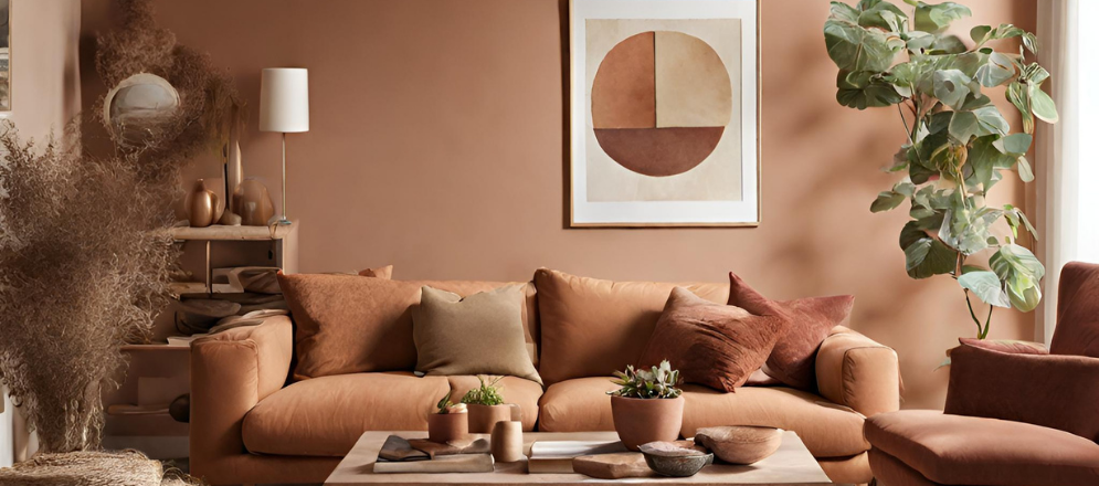
Living Room
These social spaces benefit from warm and inviting colours. Earthy tones like warm beige, soft terracotta, or shades of warm grey can make the room feel cosy and welcoming. Accent walls with warm, rich colours like deep red or burnt orange can add vibrancy without overwhelming the space.
Kitchen
The kitchen is a space where energy and vitality are essential. Shades of yellow, red, or vibrant orange can stimulate appetite and conversation. Incorporate these colours in kitchen walls, backsplashes, or even through colourful accessories.

Kitchen
The kitchen is a space where energy and vitality are essential. Shades of yellow, red, or vibrant orange can stimulate appetite and conversation. Incorporate these colours in kitchen walls, backsplashes, or even through colourful accessories.
Study Room
For a study or home office, it's vital to choose colours that promote concentration and focus. Shades of green or soft blues can enhance productivity, while neutral ton.es like beige or grey can provide a clean and uncluttered backdrop for work.

Dining Room
For the Dining room, choose warm, rich colors like deep burgundy, dark blue, or forest green. These colours create a cozy and inviting atmosphere, making it the perfect space for good conversations, sharing meals, and making memories.

Call us for Painting Services
![]() 1800-209-5678
1800-209-5678
Let our experts help you!
XAre you looking for home interiors?
Get tailored made designs from our interior design services by asian paints.
Are you looking for home interiors?
Get tailored made designs from our interior design services by asian paints.
Colour Inspiration
Themes & Inspiration for Colours for Your House
1. Checklist for Matching Colours with Your Home Theme

After determining your desired colour and mood, take a final step to ensure your Colour Scheme aligns with your Home Theme. And for the same, you can use the below-given checklist below -
Define Your Theme:
Start by identifying the theme or style you want for your home, whether it's modern, rustic, or coastal.
Choose a Dominant Colour:
Select a primary colour that aligns with your theme, setting the overall tone for your space.
Supporting Colours:
Pick complementary colours that enhance the dominant colour and contribute to the theme.
Maintain Balance:
Use the 60-30-10 rule to distribute colours appropriately, ensuring a harmonious composition.
Test and Adjust:
Experiment with paint samples and fabric swatches to ensure your chosen colours fit your home's theme, adjusting as needed.
2. Inspiration for Colours for Your House

Seeking inspiration is an integral part of the Colour selection process. Here are some sources to ignite your creativity and discover room colour scheme ideas:
Nature:
Nature is a rich source of Colour inspiration. Observe the Colours of landscapes, flowers, and the changing seasons to find hues that resonate with you.
Art and Design Magazines:
Magazines dedicated to interior design and art often feature stunning Colour combinations in real homes and artistic creations.
Online Platforms:
Explore websites, blogs, and social media platforms like Pinterest and Instagram to discover Colour palettes used by design enthusiasts and professionals. You can also explore Asian Paints Colour Visualizer to visualize various styles.
Historical and Cultural References:
Look to historical periods and cultural influences for unique Colour combinations. Ancient architecture, traditional textiles, and global cultures offer a wealth of inspiration.
Colour Trends:
Determine the current colour trends in interior design, for you can also find out more about them on the Asian Paints Colour Trends page.
Personal Experiences:
Draw inspiration from your personal experiences and travels. Memories of places you've visited or cherished moments can inspire Colour choices that hold special meaning.
Colour of the Year
How can you use the Asian Paints Colour of the Year 2023 in your House?
Each year, our team of experts at Asian Paints comes together to select the Colour Of The Year 2023. As colour of 2023, Asian Paints picked Silver Escapade, representing this shimmering hue chosen for its timeless and versatile qualities, signifying a sense of reflection, hope, and progress. It encapsulates our journey through life's diverse experiences, resonating with our dreams of the past and the potential of the future. Hence this colour not only complements various aspects of our lives and creative expressions but also the beauty of your house.
Ways to Use Silver Escapade in Your Home:
Accent Walls:
This 2023 color of the year can serve as a captivating accent wall, adding a touch of sophistication and modernity to living rooms, bedrooms, or dining spaces. Its reflective quality creates a unique focal point.

Furniture and Upholstery:
Elevate the ambiance of your home by incorporating colour of 2023 into your furniture choices. From accent chairs and sofas to ottomans, this colour adds a touch of elegance and a sense of timelessness to your interior decor.

Accessories and Decor:
Bring the allure of Silver Escapade, 2023 color of the year, into your living spaces through smaller decorative elements. Consider using it in throw pillows, rugs, curtains, or artwork. These versatile accents offer an easy and customizable way to infuse your rooms with a hint of futuristic charm.

Painted Cabinetry:
For those looking to break away from convention and embrace innovation in the kitchen or bathroom, painting cabinetry with Silver Escapade brings an element of playfulness and creativity. This colour choice disrupts traditional color schemes, offering a fresh and contemporary take on interior design.

Now that we’ve learned all about colours from principles, concepts, psychology, and Asian Paints Colour of the Year, let’s learn about how even the study of Vaastu can help you determine the colour for your house.
Colour Shastra
The Relationship between Vastu and Colours

Vastu Shastra of Colors is an integral aspect of the ancient Indian art of architecture and design. It revolves around the profound idea that the colors you choose for your home can significantly influence the energy and atmosphere within. It's a belief that dates back centuries, where each color is thought to carry a distinct vibration that can either enhance or hinder your well-being.
To put it simply, Vastu Colors is all about picking the right colors for each room in your home to create harmony and positivity. By understanding the characteristics and effects of different colors, you can tailor your living spaces to support your physical, mental, and emotional well-being.
Here's a quick overview of how you can use Vastu Shastra Colours or Vastu Colours for your home to create a balanced and inviting environment in your home -
Living Room:
Opt for warm and inviting Vastu Shastra Colour like earthy tones, soft yellows, or soothing blues. Room colour combinations of these colours help to encourage social interaction, relaxation, and a sense of warmth in your living space.

Kitchen:
Bright and lively Vastu Shastra Colours shades like red or orange can stimulate energy and creativity in the kitchen, making it an ideal space for preparing delicious meals.

Bedroom:
Choose calming and restful vastu room colour hues such as soft greens, pastel pinks, or gentle blues. These bedroom wall colour combination hues will promote serenity, restful sleep, and intimacy in your bedroom.

Bathroom:
Crisp and clean vastu room colours like white or light pastels can create a sense of cleanliness and purity, enhancing the hygiene and tranquility of your bathroom.

Home Office:
Opt for energizing vastu room colours like shades of yellow or light green to foster focus and productivity in your workspace.

Children's Room:
Vibrant and playful colors like shades of orange, purple, or bright green can stimulate creativity and enthusiasm in a child's room.

Remember that while Vastu Colors provides valuable guidance, personal preferences and the overall aesthetics of your home should also be considered. Striking a balance between Vastu principles and your style can help you create a harmonious living space that nurtures your well-being. We also recommend consulting an expert to get a better understanding, as this study provides general guidance.
Now, as we move forward, let's delve into the essential factors for interior and exterior painting. We'll also explore the harmonious color combinations that best suit different areas of your home, ensuring a well-balanced and aesthetically pleasing living environment.
Interior Painting
Interior Painting Factors and Colour Combinations
1. Factors to Consider For Interior Painting

Selecting interior paint colours allows you to personalize your living spaces and set the ambiance for each room. When choosing interior paint colours, several factors come into play. Here's a checklist to guide you through the process -
Functionality of the space:
Consider the purpose of each room and choose wall color combinations that suit it.
Natural Light:
Assess how much natural light the room receives and select colours accordingly.
Colour Psychology:
Understand how wall color combinations can affect emotions and choose hues that align with your room's intended atmosphere.
Architectural Elements:
Ensure that your chosen wall color combinations complement existing architectural features.
Personal Style:
Infuse your style into the wall color combinations selected.
Colour Combinations:
Experiment with complementary or analogous wall color combinations to create dynamic combinations.
Testing Samples:
Test paint samples in your specific space before making a final decision.
2. Colour Combinations for Interior Area Painting
In this section, we will explore appealing house colour combinations for interior painting, showcasing the best house colour combinations and trending paint colours
Home Interior Colour Combinations
Tranquil Blues and Neutrals:
Soft blues and neutral shades like beige or grey create a calming atmosphere for bedrooms and living rooms. This house colour combination can add depth through variations of blue and neutrals when used on accent walls or furniture.

Elegant Black and Gold:
Timeless and sophisticated, black and gold can lend a luxurious feel to dining rooms or home offices. In this case, the house colour combination is not just the key but also proper lighting is required to balance the richness.

Refreshing Green and White:
Green and white bring a fresh and clean vibe, is the ideal home interior colour for kitchens and bathrooms. Enhance the natural theme with indoor plants.

Vibrant Red and White:
Red, when used as an accent with white, adds energy and contrast. Perfect for lively dining areas or study rooms.

Earthy Tones with Warm Oranges:
Combining earthy tones like brown and green with warm oranges creates a cozy and welcoming atmosphere, ideal for family rooms or dens. Wooden elements enhance warmth.

Exterior Painting
Exterior Painting Factors and Colour Combinations

1. Factors to Consider For Exterior Painting
The exterior of your home makes a significant first impression. Choosing the right exterior house colours involves several considerations. Here's a checklist for selecting exterior paint colours -
Architectural Style:
Align the colours with your home's architectural style.
Neighborhood Aesthetics:
Harmonize with the surrounding houses while adding a unique touch.
Exterior Materials:
Consider how colours will interact with the materials used on the exterior.
Climate Considerations:
Think about your region's climate when choosing exterior colours.
Trim and Accent Colours:
Plan trim and accent colours that complement the primary exterior colour.
Personal Expression:
Let your personality shine through your exterior house colour selection.
Sample Testing:
Test paint samples to see how they look in different lighting and against other elements.
2. Exterior House Color Combinations
Classic White and Navy Blue:
Timeless and elegant, this house colour combination for the outer colour of the house, with white as the primary color and navy blue accents, exudes sophistication and curb appeal.

Mediterranean Terracotta and Cream:
Perfect for the outer colour of house with stucco exteriors or those seeking a warm and inviting look, pairing terracotta with cream brings a Mediterranean touch.

Modern Grey and Teal:
This modern choice for a contemporary house colour combination, grey as the dominant outer colour of the house with teal accents adds a modern touch to exteriors.

Nature-Inspired Greens and Browns:
Inspired by nature, this house front colour combination uses various shades of green and brown, ideal for homes surrounded by natural beauty. Experiment with different shades for a natural look.

As you follow this guide, we hope you're able to create a haven with beautiful room colour schemes in your home.
Mixing And Matching Colours
Mixing and matching colors in your home decor can be a fun and creative way to express your personal style. Whether you're choosing colors for your walls, furniture, textures, or other elements in your home, creating harmonious home colour combinations is key. Here are five steps to help you master the art of color pairing and achieve stunning home color combinations:
Start with a Color Palette
Begin by selecting a color palette that serves as the foundation for your entire home. You can find inspiration from various sources, such as nature, art, or your favorite color schemes. A popular approach is to choose a dominant color, a secondary color, and an accent color. This combination will guide your choices for walls, furniture, and decor items.
Establish a Focal Point:
Identify a focal point in each room, which could be a statement piece of furniture, an eye-catching artwork, or a wallpapered accent wall. Use your chosen color palette as a guide to select colors that complement the focal point. This helps in creating a cohesive look while allowing some flexibility with other elements in the room.
Play with Color Temperatures
Consider the temperature of colors when combining them. Warm colors like reds, oranges, and yellows can create a cozy and inviting atmosphere, while cool colors like blues and greens evoke a sense of calm. Mixing warm and cool colors can result in a balanced and visually appealing combination. For example, pairing a cool blue sofa with warm, earthy-toned throw pillows can create a dynamic contrast.
Experiment with Textures and Patterns
Diversify your home's visual appeal by incorporating various textures and patterns. Mixing matte and glossy finishes, smooth and rough textures, and patterns like stripes, florals, or geometrics can add depth to your color scheme. Just ensure that these textures and patterns align with your chosen color palette to maintain a cohesive look.
Test and Adjust
Before committing to a full-scale makeover, test your chosen color combinations in small doses. Paint sample swatches on your walls, try out different furniture and fabric samples, and arrange decor elements to see how they work together. Adjust as needed to achieve the desired balance and harmony. It's crucial to ensure that the color pairing, textures, and patterns you select create a pleasing and comfortable environment.
With this you can master the art of colour selection and creating beautiful home color combinations involves careful planning and experimentation. By starting with a well-defined color palette by understanding colour theory, considering color temperatures, incorporating textures and patterns, and more, you can achieve a harmonious and visually appealing home decor that reflects your unique style and personality. Although, if you do get stuck on the question that ‘how to choose a color for my home?’ then our Team at Asian Paints is here to guide you through this colourful journey.
How can Asian Paints help you with Colour Selection?
At Asian Paints, we're not just here to assist you in selecting the perfect colours; we're committed to helping you turn your house into a beautiful and aesthetic haven. Our dedicated team of colour experts, and interactive tools like the colour visualizer, personalized Home Colour Guide service, and Asian Paints own Colour Catalogue are all designed with you in mind. We're with you every step of the way to ensure your vision of a stunning and harmonious living space becomes a reality. Your dream home is just a brushstroke away, and we're here to make it happen.
Call us for Painting Services
![]() 1800-209-5678
1800-209-5678
Let our experts help you!
XAre you looking for home interiors?
Get tailored made designs from our interior design services by asian paints.
Are you looking for home interiors?
Get tailored made designs from our interior design services by asian paints.


