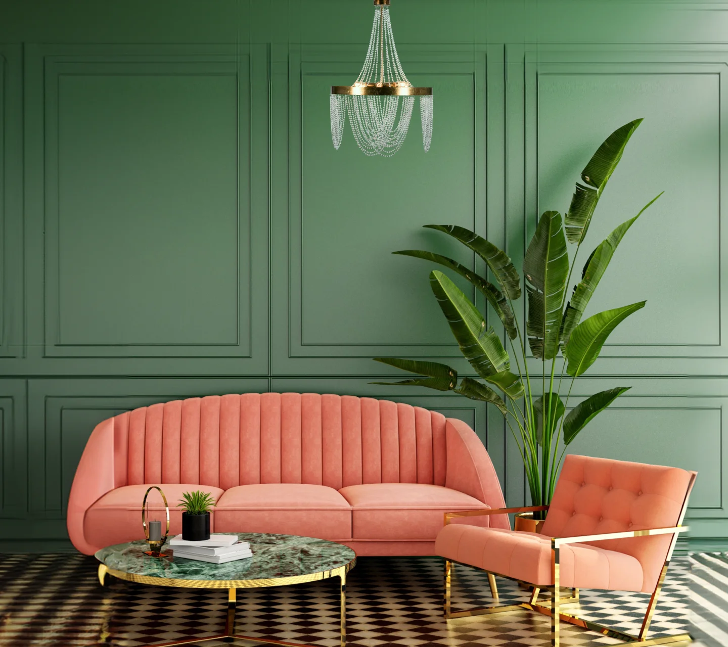
Felicity reflects a change in behaviour – a conscious choice to consume things that possess real value over flaunt value of an ephemeral nature. Indulgence takes a backseat as we surround ourselves with things that serve a purpose, are beautiful and provide us a lasting sense of comfort. Things that add abundance in our lives by eliminating the frills. In the ColourNext Trend Report, we take a closer look at how this change in our values drives us to revisit the fundamentals of design – of endurance over pure aesthetics.

Contentment
We introspect on what’s essential to living our most optimum life. Do we need hundreds of clothes in an overflowing wardrobe or that cool speaker when we already have four others?

Timeless & Meaningful
As we adopt these principles, brands around the world are forced to rethink their offerings around watchwords like restraint, durability and responsibility. It's not reductive and about cutting down all excess. It's about living with intention, choosing what one chooses because it serves a purpose be it intangible or functional.
Colour
Forecast
There’s a timeless charm to the palette of Felicity, made of colours that have endured over a long period of time and yet unwaveringly appeal to us. A balance of dark and pale colours that are classic yet have an uncanny ability to envelope contemporary forms and spaces.

Inspiring ideas for your home
Find decor inspiration and popular colour schemes in our ideas gallery.


