TRENDING
complementary colour schemes
Home Painting
Complementary Colour Schemes That Will Make Any Room Pop
Importance of complementary colour schemes
Complementary colour schemes are crucial in design due to their ability to create visual harmony and impact. These schemes involve colours opposite each other on the colour wheel, such as blue and orange or red and green. When used together, complementary colours enhance contrast, making elements stand out, which is particularly beneficial in branding, marketing materials, and user interfaces. This heightened visual interest can attract attention, convey emotions effectively, and improve readability.
Additionally, complementary colour schemes contribute to a balanced and aesthetically pleasing composition, ensuring that designs are both engaging and professional. Understanding how to apply these colour pairings allows designers to craft compelling visuals that resonate with their target audience and reinforce brand identity.
Let us explore the significance of complementary colour schemes and their role in producing successful and impactful designs.
IN THIS ARTICLE
Importance of complementary colour schemes
Complementary colour scheme: Colour theory
Benefits of using the complementary colour scheme
Complementary Color Schemes For Home
Step-by-Step Guide to Prepare Your Room for Painting
Complementary colour scheme: Colour theory
Understanding the tiers of colour, and how they interact within complementary schemes, enables designers to craft compelling visuals that effectively capture attention and convey intended messages.
- Primary colours
- Secondary colours
- Tertiary colours
Primary colours are the foundational hues from which all other colours are derived. These colours—red, blue, and yellow—cannot be created by mixing other colours and serve as the building blocks for the colour spectrum. In design and art, understanding the interaction of primary colours is essential for creating vibrant and balanced compositions.
Secondary colours are formed by mixing equal parts of two primary colours. The three secondary colours are green (blue and yellow), orange (red and yellow), and purple (red and blue). These colours expand the palette available to designers, offering more options for creating dynamic and visually appealing designs.
Tertiary colours are created by mixing a primary colour with a neighboring secondary colour. This results in six tertiary colours: red-orange, yellow-orange, yellow-green, blue-green, blue-purple, and red-purple. Tertiary colours provide additional nuances and depth to colour schemes, allowing for more sophisticated and harmonious designs.
Benefits of using the complementary colour scheme
Using complementary colour schemes offers several notable benefits in design, enhancing both aesthetic appeal and functional effectiveness:
Enhanced Visual Contrast:
Complementary colours create a strong contrast that draws attention. This makes key elements stand out, which is particularly useful in advertising, branding, and user interface design.
Emotional Impact:
Complementary colours can evoke strong emotional responses. The juxtaposition of warm and cool tones can convey balance, harmony, and dynamism, making designs more engaging and memorable.
Improved Readability:
High contrast between complementary colours improves readability and legibility, particularly in text and background pairings. This ensures that messages are clear and accessible to viewers.
Aesthetic Harmony:
When used correctly, complementary colours can create visually harmonious compositions. This balance can enhance the overall aesthetic quality of a design, making it more appealing to the eye.
Versatility:
Complementary colour schemes are versatile and can be applied across various mediums, including print, digital, packaging, and environmental design. This flexibility allows for consistent branding and cohesive visual communication.
Focus and Direction:
The strategic use of complementary colours can guide the viewer's eye to specific areas of a design, helping to emphasize important information and direct attention appropriately.
By leveraging these benefits, designers can create impactful, professional, and aesthetically pleasing work that resonates with their audience and achieves desired outcomes.
Complementary Color Schemes For Home

1. Blue and Orange
This classic complementary pair creates a lively and refreshing atmosphere. The coolness of blue balances the warmth of orange, making it ideal for living rooms or kitchens. Use blue for larger areas like walls or sofas, and incorporate orange accents through cushions, rugs, or artwork.

2. Red and Green
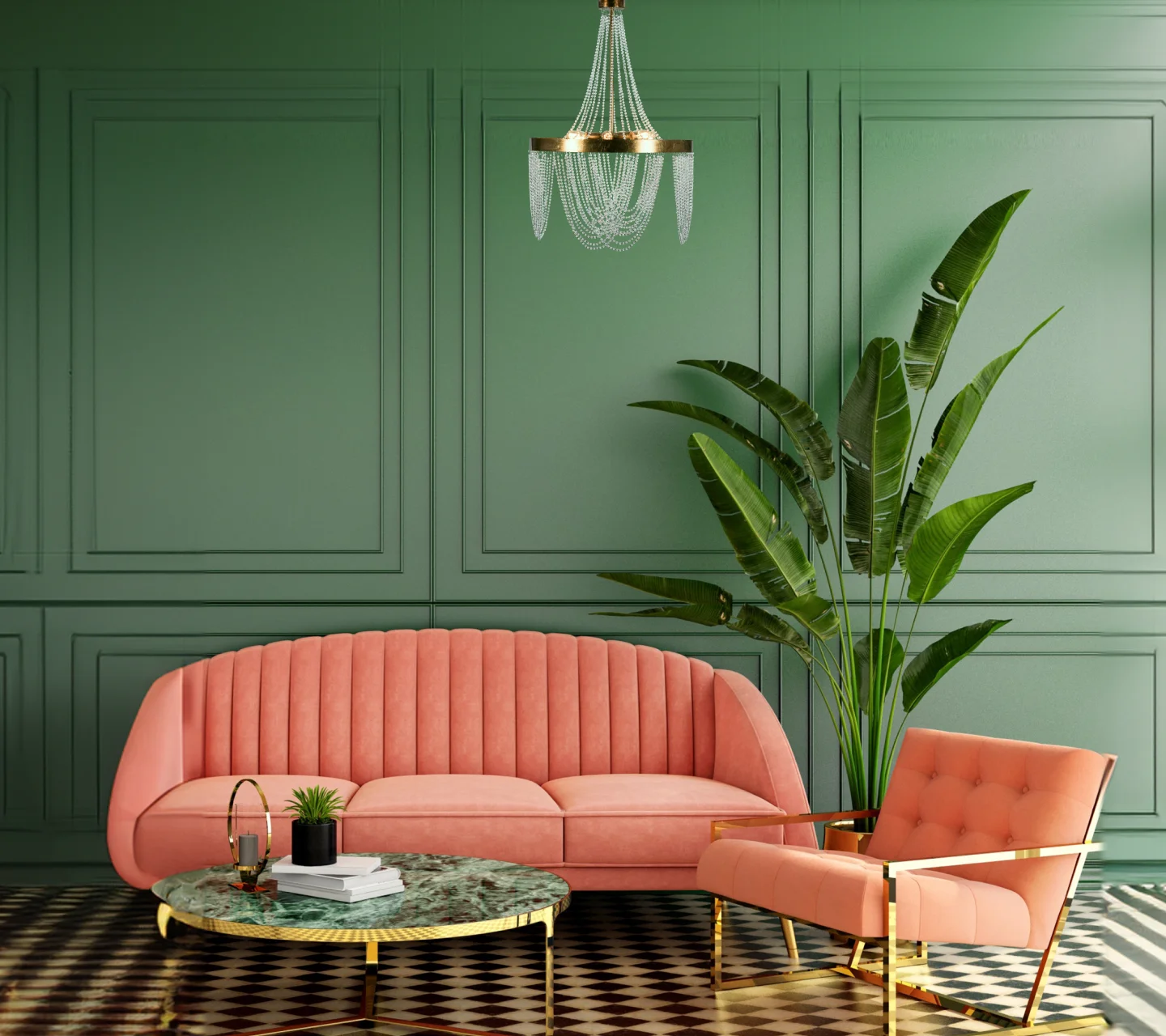
Red and green can bring a vibrant and energetic feel to any space. Perfect for dining rooms or home offices, this combination stimulates and invigorates. Opt for a muted red on walls or furniture and complement it with green plants or decorative items for a balanced look.

3. Yellow and Purple
A yellow and purple scheme adds a touch of luxury and sophistication. Ideal for bedrooms and bathrooms, the warmth of yellow provides coziness, while purple introduces a regal elegance. Use soft yellow for walls and larger surfaces, and accentuate with purple accessories such as bedding or towels.

4. Teal and Coral
Teal and coral create a fresh and contemporary ambiance, perfect for family rooms or outdoor spaces. Teal’s calming effect pairs beautifully with the lively energy of coral. Use teal as the dominant color and highlight with coral in throw pillows, vases, or patio furniture.

5. Navy and Mustard
Navy and mustard offer a bold yet timeless palette suitable for formal living areas or libraries. The depth of navy provides a rich backdrop, while mustard adds a cheerful contrast. Incorporate navy through wall paint or sofas, and use mustard in curtains, cushions, or lampshades to achieve a sophisticated look.

6. Pink and Green
Pink and green evoke a fresh, garden-inspired feel that works well in nurseries or sunrooms. Soft pink walls combined with leafy green decor create a serene and inviting environment. Enhance the look with green plants and pink floral patterns to bring the outdoors inside.
Step-by-Step Guide to Prepare Your Room for Painting
Gather Supplies: Before starting, ensure you have all the necessary supplies.
Clear the Room:
Remove all furniture, decorations, and fixtures from the room. If some items are too large to move, place them in the center of the room and cover them with drop cloths.
Protect Floors and Fixtures:
Cover the floor with drop cloths or plastic sheeting to protect it from paint splashes. Use painter’s tape to cover baseboards, window frames, door frames, and any other fixtures that shouldn't be painted.
Clean the Walls:
Clean the walls thoroughly to remove dust, dirt, and grease. Use a mild soap solution or TSP for tougher grime. Allow the walls to dry completely before proceeding to the next step.
Repair and Smooth Surfaces:
Inspect the walls for any holes, cracks, or imperfections. Use a spackle to fill in any small holes or dents, and a putty knife to smooth it out. For larger holes, you may need a patch kit. Once the spackle is dry, sand the repaired areas and any rough spots to ensure a smooth surface.
Remove Outlet Covers and Switch Plates:
Take off all outlet covers, switch plates, and any other removable fixtures. This ensures you get a clean, professional-looking paint job. Keep screws and small parts in a safe place so you can easily reattach them later.
Prime the Walls:
If the walls have marks, stains, or you're making a drastic colour change, apply a coat of primer. Primer helps the paint adhere better and provides a uniform base for the new colour. Allow the primer to dry as per the manufacturer's instructions.
Apply Painter's Tape:
Apply painter’s tape along the edges of the ceiling, baseboards, and around windows and doors. Press the tape firmly to prevent paint from seeping underneath. This will help you achieve clean, sharp lines.
Ventilate the Room:
Ensure proper ventilation by opening windows and doors. Adequate airflow helps the paint dry faster and reduces fumes.
Set Up Your Painting Tools:
Pour paint into a tray and have your brushes, rollers, and ladder ready. Starting with a well-organized setup will make the painting process smoother and more efficient.
Frequently Asked Questions on Dark Pink Colour Combinations
1. What colour schemes complement one another?
Complementary colour schemes involve pairs of colours that sit opposite each other on the colour wheel. Common complementary pairs include:
Blue and Orange
Red and Green
Yellow and Purple
These combinations create high contrast and vibrant looks, making them effective for drawing attention and balancing designs.
2. Which seven primary colour schemes are there?
The seven primary colour schemes commonly recognized in design are:
Monochromatic: Variations of a single colour.
Analogous: Colours next to each other on the colour wheel.
Complementary: Colours opposite each other on the colour wheel.
Split-Complementary: A base colour and two adjacent to its complement.
Triadic: Three colours evenly spaced around the colour wheel.
Tetradic (Double-Complementary): Two complementary pairs.
Square: Four colours evenly spaced around the colour wheel.
3. What does the term complementary colours mean?
Complementary colours refer to pairs of colours that are opposite each other on the colour wheel. These colours, such as red and green or blue and orange, create a strong visual contrast when used together, enhancing the vibrancy and dynamic quality of a design.
4. For what reason are colour schemes used?
Colour schemes are used to create visual harmony, guide the viewer's eye, evoke emotions, and enhance the overall aesthetic appeal of a design. They help in establishing mood, reinforcing brand identity, improving readability, and ensuring that different elements of a design work well together.
5. How can an interior designer employ a complementary colour scheme?
An interior designer can employ a complementary colour scheme by selecting a dominant colour for large areas like walls or furniture and using its complement for accents and decorative items. For instance, a living room might feature blue walls with orange cushions and artwork. The balance between the main colour and its complement helps create a cohesive, visually appealing space that feels both dynamic and harmonious.
How Can Asian Paints Help You With Home Painting?
Asian Paints offers a comprehensive range of home painting services to transform your space. Our services include colour consultation, professional painting, wall textures, and waterproofing solutions. With numerous stores across India, you can easily access our high-quality products and expert advice. Additionally, our trained painters ensure a hassle-free experience, delivering impeccable results tailored to your preferences and needs.
Visit your nearest Asian Paints store or explore our services online for more details!
LIKE THIS ARTICLE
Give us a thumbs up!

TEXTURE FINISH


